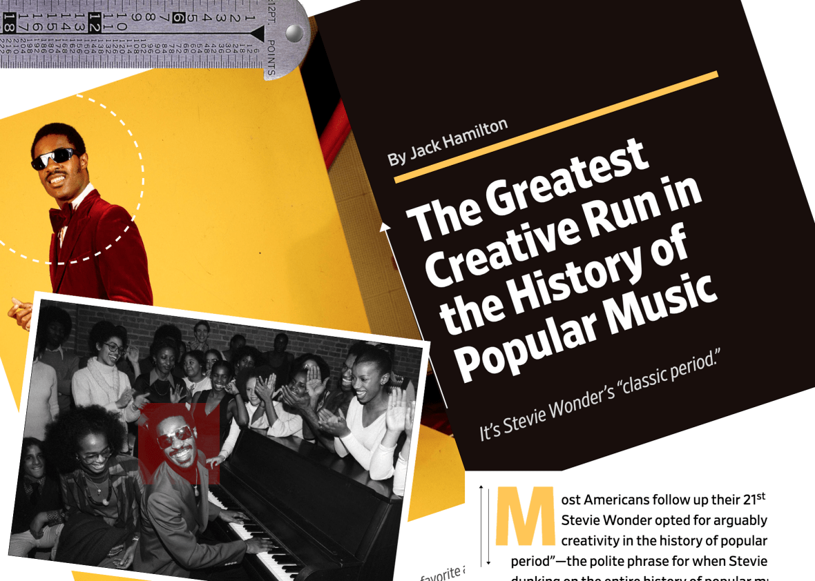

You may have noticed that the weekly Cover Story we published today does not look like other articles on the site. It has bigger photos, new typefaces, and a more elegant layout. The article, an essay on Stevie Wonder, is the public debut of a project—internally dubbed “Slate Redux”—that will explore the future of design and publishing at Slate. The project will have many expressions—a new process for collaboration across teams, better communication, and new design work. We’ve assembled a cross-disciplinary group of people from editorial, design, product, development, and sales to prototype how we’d like to work together, and we’ll be using Slate’s weekly Cover Story as our sandbox for that experimentation.
You might ask: Why are you biting off just a piece of the site rather than redesigning everything at once?
The answer is that Slate is not simply our website. The site is one place where Slate lives, but Slate exists in a variety of places, from social platforms like Facebook, to your podcast app, to the public spaces where we host live events. So rather than making this a monolithic redesign project, in which we look for a single design answer that will work wherever Slate lives, we are starting with a small, though important, corner of the magazine. In rethinking how we produce and design the big, splashy pieces we publish at the top of the week, we’re gathering information about what works—and how we work—and setting ourselves up to take those lessons to other parts of the whole.
Today’s Cover Story is a first effort, a small step. And right now it’s incomplete—you won’t find comments, search, user accounts, navigation, and many other things you’re used to seeing on a Slate page. But we wanted to start testing our ideas and getting feedback—from our colleagues and our readers—so that we can start making improvements not only to how the page looks but to how it was made.
Over the coming weeks some of the things we will be experimenting with are design, our publishing process and tools, collaborative methods, and new, flexible ad products. All with a goal of creating a solid foundation that also allows us to adapt as our needs change. Taking time like this to test our assumptions will give us the information we need to take on other challenges, like broadening our visual palette and design and upgrading our publishing platform.
But it all starts with Cover Stories. We’ll test our assumptions about how the site looks, how we organize information, and how we collaborate. We’ll discuss, measure, experiment, and iterate on every aspect of the project. And in time a clear picture will begin to emerge of what Slate should look and feel like no matter where you encounter it. (Because we’re still in the very early stages of Redux, not every Cover Story will appear in a new format, at least till we get our sea legs under us.)
Because we’re doing this experimentation in public view, we also plan to share our thinking about the changes we’re making on this blog. Over the coming weeks and months we’ll continue making improvements—and surely experience some stumbles—and we’ll document it all here for you.
[Source:-Slate]


