 The Hillary Clinton campaign might just have the most comprehensive brand identity in presidential history. In stark contrast to the clumsy, ham-fisted efforts of her design-challenged opposition, every aspect of Hillary Clinton’sbrand identity has been agonized over, from the Pentagram-designed arrow logo to the campaign’s Pantsuit UI, all thanks to a world-class design stable that includes industry titans such as Michael Bierut, Jesse Reed, and Jennifer Kinon.
Lesser known, but no less important to the success of Hillary’s visual identity? Lucas Sharp, a young, Parsons-trained type designer whose eponymous font, Sharp Sans, was chosen as the official typeface of the Hillary Clinton 2016 presidential campaign. A friendly, authoritative geometric sans serif that can also wither when it’s aimed mockingly at Trump, Sharp Sans is the glue that helps bind together Hillary’s campaign and get her message to voters.
But how did Sharp Sans become to Hillary 2016 what Gotham was to Obama 2008? The answer has its surprising origins in the counterculture design world of the late 1960s.
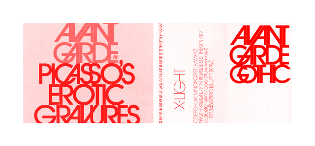
The story of Sharp Sans starts almost 50 years ago, with Avant-Garde, a famously progressive counterculture magazine designed by the legendary Herb Lubalin. Published for just 14 issues between 1968 and 1971, Avant-Garde made a huge splash in New York’s advertising circles, thanks to the power of the magazine’s postmodern editorial designs, which included covers featuring still taboo imagery like nude pregnant women, or a parody of The Spirit Of ’76 featuring a white woman and black man instead of the original white male subjects.
When Avant-Garde folded, the geometric sans serif lettering used for its logo and headlines was fleshed out into a more complete typeface, ITC Avant Garde, by Lubalin and type designer Ed Benguiat. (Stranger Things fans, note that the show’s typographically beloved intro pairs ITC Avant Garde with Benguiat’s own eponymous typeface.)
But it’s hard to modify a logo design into a font, and ITC Avant Garde had problems, says Sharp. The original letters were all caps, making the lower-case versions clear afterthoughts. Additionally, Lubalin’s original designs were meant to be goosed by hand, not auto-kerned. To Sharp’s eyes, it made ITC Avant Garde always look a little wonky. So when he launched his new eponymous type design studio late last year, he did so with a font that aimed to pay tribute to ITC Avant Garde and other geometric sans serifs of the 1970s, while fixing those small issues.

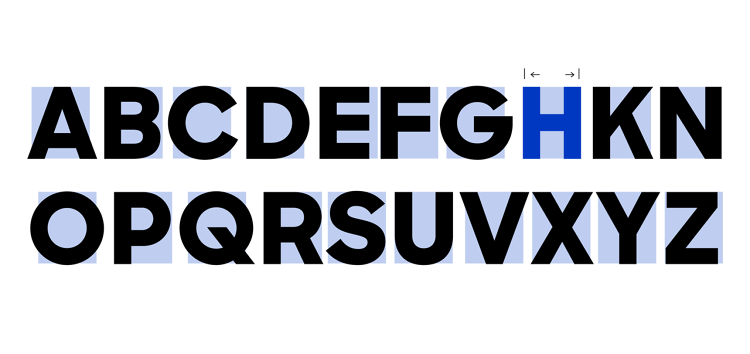
At its core, the design of Sharp Sans is based upon the circle. When you look at Sharp Sans, you can see that every curve is circular, from the aperture of the “o” to the inner curve of the “s.” It isn’t a perfect circle mathematically—it’s what’s called an optically perfect circle, a “perfect” circle as most human eyes prefer it, very slightly wider than they are tall. From there, every letter of Sharp Sans only has a singly stroke width, and angles tend to be variations of 45 of 90 degrees. Sharp tells me that in addition to picking up influences from ITC Avant Garde, he was also inspired by Futura, Avenir, Gotham, and “Frutiger Frutiger Frutiger.” After putting all those influences in a blender, Sharp Sans was meant to be “an amalgam of everything that’s useful,” and an “embodiment of the platonic neoliberal sans serif.”
Metaphysical type aspirations, to be sure, but when Michael Bierut discovered Sharp Sans in early 2015, the Pentagram founder was impressed—impressed enough to float the font by Hillary Clinton’s design director, Jennifer Kinon, as a choice for Hillary 2016’s official typeface. Under Kinon, Sharp went back to the drawing board, further fleshing Sharp Sans out with slab, grotesque, and stencil variations. “Michael and Jennifer were really attached to the original Sharp Sans, but I was adamant that it needed to be more flexible,” Sharp says. “In a presidential campaign, a typeface needs to look good anywhere, from email templates and impromptu fliers to posters and banners.” The Hillary-approved version of Sharp Sans fulfills all those criteria. “Hopefully, this will be the last version, since I’m sick of drawing this thing,” quips Sharp.
But why did the Hillary Clinton campaign specifically decide to go with Sharp Sans? According to Pentagram’s Michael Bierut, who helped author the campaign’s visual identity, the campaign early on decided to favor sans serif fonts rather than serif, and upper and lower case versus all capitals.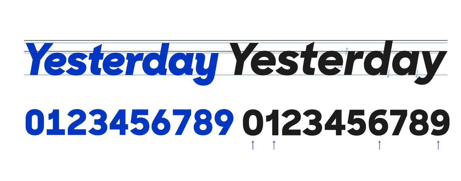
“The sans serifs were fresher—Secretary Clinton had used serif types in her previous presidential and senatorial campaigns—and the upper and lower case seemed more friendly and approachable,” he says. “As we compared all the options available, Sharp Sans stood out. The simple geometric forms complimented the ‘arrow H’ logo we were developing, and we particularly liked the drawings of specific letterforms, like the one-story lowercase ‘a’ and the round dots over the ‘i.’ In its heavier weights it seemed bold yet conversational, exactly the balance we were looking for. ”
Sharp, though, seems shy about a lot of those kind words. Instead, he chalks up his success to a far more accidental source. “I think I came around with the right design at the right time,” he says. “At the end of the day, it’s just what’s in vogue right now.” Look at another geometric sans serif font, Gotham, which Obama used in 2008, and which Sharp calls “probably the most overused font in the world” right now. It’s popular, though, because it’s friendly and authoritarian. “Sharp Sans is a fresh face on a similar idea, which is why it’s a good match for Hillary,” says Sharp.
And what font would be a good match for Hillary’s opponent, Donald Trump? To that question, Sharp at first starts cackling. “Oh, that’s a great question . . . something cheap, and like on sale for $0.99 at MyFonts,” he says at first. But then Sharp thinks twice. “On second thought, I better not answer,” he says apologetically. “I don’t want to offend anyone by naming their font as the Trump font. This is a great business I’d like to stay a part of for a long time.”
[Source:-Co design Blog]