When we begin a design project at O+A, I tell my designers not to start with a Pinterest page. Then they each scurry away and start one privately anyway. There is no question that Pinterest is a useful tool. It’s great to have access to all those images. But I wonder how Pinterest and Instagram and the other image-oriented sites are changing the design process—and if they’re actually changing it for the better.
O+A just finished a competition for an office-design project in South America. Our concept was “Come to the Table”—the table being a symbolic and physical place to gather, to collaborate, and to trade ideas. Pinterest was a huge help in collecting images of tables and of people gathering, but when we started another folder of designs that had the feel of what we were going after, I realized we had launched our design process by looking at other people’s work.
All design firms do this. It is the industry’s accepted way of working. But is it the best way?
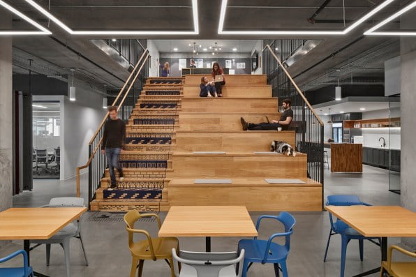
For the South American project, we wanted to create a stadium-style staircase. We’ve done a few of these and have considerable expertise in the matter. On Pinterest, we found other stadium-style staircases similar to ours. Were their designers inspired by our work? Will we be inspired by their variations? My fear is that we are creating a closed loop. There is much to look at, be inspired by, and get cues from, but eventually with everyone looking at everyone else’s designs, surely they will vary less and less. Little new and original will be explored.

In some ways, design is better today because of the proliferation of images on the Internet. As designers, we have become adept at creating big moments, the ones that end up going viral on Instagram; some projects get several of these “wow” moments.
We’ve scrolled through so many vivid images that we instinctively create them in our designs—but sometimes it’s to the detriment of depth, meaning, even function. An Instagram moment is a one-shot deal. One photo has to grab your attention—and it goes by fast.
But the spaces we’re designing are not “moments.” They are places their occupants will experience throughout the day. As designers we must ask ourselves: Are we creating beautiful, functional spaces—or are we merely creating social-media-friendly moments?
I remember a project we worked on in 2013 that had several of these drop-dead moments. Lush velvet, gold mirrors, a seductive departure for workplace design. But the bulk of the workplace, where the workers actually spent their days, was very gray and plain. It is a strategy designers employ to maximize the budget by concentrating efforts in key areas: at the entry, at an important location, or a visible node. It’s a sound strategy and has worked well for us over the years. It also helps get client buy-in. The client gets excited about one of these moments and green-lights the entire project.
I don’t think focusing on these moments necessarily comes at the expense of the individual worker. But budgets can get eaten up that could otherwise get spent improving the individual’s work condition. I was impressed by a tech client in San Francisco who recently insisted on adding a costly system of individual environmental control and acoustic privacy. The system added nothing to the aesthetics, was completely invisible, and the story was an internal one only. Similarly, firms that choose environmentally friendly projects and create green buildings have decided that the design moments maybe aren’t the top focus.
Of course, designers aren’t the only ones looking at social feeds and blogs. Clients and their employees are looking too. What HGTV, Architectural Digest, and the various design magazines first started, Instagram, Pinterest, Dezeen, Office Snapshots, and the like have taken to another level. Design sophistication is evidenced by the popularity of designer stores and products.
It is exciting to think of design touching so many corners of the earth. But for a designer designing for a now visually savvy client, it can pose problems. Our clients sometimes have preexisting expectations. Sometimes they have already designed the space in their own heads. They might like what they see somewhere else, which disrupts a design process that is intended to solve problems and convey that client’s unique culture.
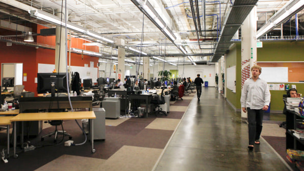
I remember the project that first brought Studio O+A serious attention, almost 20 years after opening our doors. It was Facebook’s first corporate headquarters in Palo Alto, and we completed it in 2010.

The headquarters was only a short-term space with a three-year lease. Everything had to be down and dirty; no extra expense, nothing unnecessary, no big moments. It got published widely because it was Facebook, not because it had “wow” moments.
For the press photo shoot, we concentrated on the way the whole complex worked—the distinct “neighborhoods,” the skateboard tracks for easy travel around the office. There was barely a lobby, but lucky for us, a group of Facebook employees “defaced” the reception area with graffiti. Initially we were horrified, but we quickly realized it completed our design in a raw and improvised way that was more original than anything we could have come up with. This was part of our design process for Facebook. They were known for “hacking,” so we invited them to hack our design.
We allowed ourselves to take that journey with our client because we weren’t caught up in what other designers were designing on Instagram, which was launched that same year. We weren’t looking to create a photo op.
I’d like to imagine a project that didn’t have to focus on key moments, where the design investment was more of a constant thread throughout. That space might feel more grounded and more secure. It might have tiny surprises or individual design celebrations for the careful observer.
If designers aren’t thinking about a superstar moment, if we’re not designing for the photo spread, we will approach our designs more holistically. Certainly, we will be more creative. Perhaps it’s time to turn off the flood of imagery and trust our instincts. New approaches and ideas could come from tackling the next problem, not through pictures of someone else’s work, but in the snowy storm of white nothing that every artist knows.
[“source=fastcompany”]


