
If the Apple Watch is still finding its legs, consider watchOS 3 its first pair of big-boy pants. Apple has overhauled the watch’s operating system to make it easier to navigate, given it a couple new apps, added new watch faces that emphasize fitness, and made it easier to switch between those faces.
watchOS 3 wasn’t part of Apple’s public beta program, but I’ve been kicking the tires of the developer betas since WWDC. At first my Apple Watch didn’t feel new, it felt broken. Battery life suffered and the new Maps app in iOS 10 consistently had trouble communicating between my iPhone and Apple Watch without crashing. But I’m happy to report that those issues have been fixed. Today, watchOS 3 feels stable, virtually never crashes, and speeds up most interactions I do with my Apple Watch. I recommend it for everyone.
No more Glances
Navigation is much improved, because watchOS 3 reduces your need to go to the crowded home screen of app bubbles. Glances are gone. Instead, the button below the Digital Crown now brings up a dock that shows a live preview of your favorite apps.

Apple
You can add apps to this dock in the Apple Watch app on your iPhone, in the Dock section of the My Watch tab. Any app on your watch can go in the dock, and if you launch an app from the home screen, it’ll show up as the last app in your dock, under the heading Recent. You swipe left and right to scroll through the dock, and tap a preview to open that app full-screen.
The previews you see in this dock view are supposed to be live, but in my experience, third-party apps don’t always show a live view right away. Still, these are views of the real running apps, while the old Glances were a separate, static view of each app provided by the developers. Now developers don’t have to bother designing useful Glances, and users get better information, so it’s win-win.
The favorite-friends view that used to come up when you pressed the Apple Watch’s button is now gone. I haven’t ever missed that ring of friends once. The Digital Touch features—sending a little drawing, or even your heartbeat to friends—were moved to the Messages app, which is a better home for them anyway. So just keep that app in the dock if you want quick access.
New Control Center
In watchOS 1 and 2, a quick swipe up from the watch face would enter the Glances view. But now that the dock has replaced Glances, a new Control Center screen appears instead when you swipe up from the watch face.
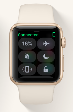
This screen shows your battery life (tap it for easy access to the Power Reserve setting), buttons to enter Airplane Mode, Do Not Disturb, or just silence your watch. The lock button instantly locks your watch with its passcode, and you can tap the button that looks like a little iPhone to make your connected iPhone make a sound—perfect for when you lost it in the couch cushions again. Scroll to the very bottom of Control Center for an AirPlay button that will let you select a set of wireless headphones or speakers for listening to the Apple Watch’s onboard music.
I love how easy these controls are to reach, especially the page-my-iPhone button, which I am embarrassed to admit I use pretty much daily. These controls used to live on a Glance, which made them less accessible. Now instead of swiping up for Glances, swiping around inside my Glances to find the Control Center, and then tapping one of its buttons, I can just swipe up and the buttons are right there.
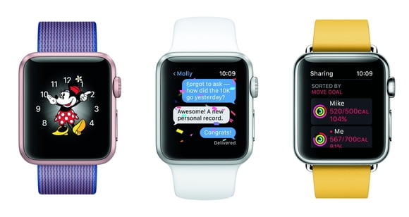
Better faces
Another big selling point of watchOS 3 are its new watch faces. When introducing Apple Watch Series 2, Apple made fitness the focus, and new watch faces in watchOS 3 incorporate the Activity rings into both analog and digital designs, so all it takes is a quick glance at your watch to see how close you are to your Move, Exercise, and Stand goals. I used to always keep an Activity complication on my watch face, but now I don’t have to, because the whole watch face acts as that complication—I can even tap the Activity rings on the face to open the full Activity app, which also got a new look (but more about that later).

The new Numerals face is quite lovely, with analog watch hands and a big bold numeral that represents the hour, and moves around the watch face throughout the day. You can set the colors and complications, of course, and even tweak the font of the large numeral.

The classic Mickey Mouse face is joined by a Minnie Mouse option that lets you choose the color of her skirt and hat. But no matter how you change the rest of her outfit, Minnie always insists on her favorite yellow pumps—I feel you, girl. Like Mickey, Minnie is animated, tapping her foot and bouncing her hips to mark the seconds while pointing at the time with her hands. Her eyelashes even flutter, a nice touch.
Overhauled Activity app
Since the Apple Watch is my favorite activity tracker ever, I spend a lot of time with the Activity and Workout apps, and in watchOS 3, Activity gets an all-new look and new sharing feature.
 Apple
ApplePreviously, the Activity app was separated into panes you swiped between: first the set of three rings, then just Move, just Exercise, and just Stand. Swiping up from any of those rings showed a timeline of your day to help you pinpoint when you did or didn’t do those things. In watchOS 3, all your activity data is on one pane. The triple ring graphic is up top, and then when you scroll down you see a much smaller representation of your Move, Exercise, and Stand progress, with your total steps taken at the very bottom.
Swipe to the other pane to see the rings of anyone you’re sharing with—naturally, they also need to have watchOS 3 and agree to share with you.
Breathe
The all-new Breathe app leads you through one minute of deep breathing, to calm you down when you’re feeling stressed. The app is beautiful—you can time your breaths to the hypnotizing animation, but if you’d rather close your eyes, you also get taps on your wrist that guide you when to inhale and exhale.
 Apple
AppleFitbit recently added a similar feature to its new Charge 2 tracker, and claims that the Fitbit can detect your breathing rate and customize the exercise to you. Apple’s Breathe app uses the same breathing rate every time, but you can tweak it in the Apple Watch app on your iPhone. I had to bump it down from the default seven breaths per minute to eight—that may not sound like it would make a huge difference, but it really has.
The Breathe app can remind you to take these breaks periodically, but in my experience the reminders tend to come at terrible times. It loves to ask me to do deep breathing in the middle of a meeting (yes, it was on my calendar), or while I’m driving in South Bay traffic—and using the Apple Watch to navigate. I still remember feeling my blood pressure rise when I heard the little New Agey chime sound in the middle of my drive. Not helpful, Breathe! Anyway, I enjoy Breathe when the reminders aren’t driving me crazy, but if I turn off the reminders, I almost never think to use the app—even with a complication on my watch face.
Home
The Home app, though, I find incredibly useful, and I immediately added its complication to every watch face I use. Home is Apple’s new HomeKit app for iOS 10. It’ll show you all the HomeKit-compatible smart home gadgets on your home network, and it lets you turn them on or off individually, organize them into rooms, and set up scenes to command multiple devices at once.
 Apple
AppleMy HomeKit setup is pretty modest—just a couple of lamps plugged into smart plugs, one from iHome and one from iDevices. I like being able to time them, or turn them on and off without getting out of bed. But having to pull out my phone to do that can be a pain, and it almost always takes longer than it would to just turn the lamp on with my hands.
iOS 10 makes it easier by putting HomeKit controls into Control Center, but they’re even more easily accessible on my Apple Watch. The Home app is one screen, with my scenes right up top: “I’m home” turns the lamps on, while “Good night” turns them off. If I keep scrolling, I can see the accessories individually, in case I want one lamp on but not the other. The buttons are big and easy to hit, and the app launches fast with no clutter. I love it.
Apple Watch app for iOS
To upgrade to watchOS 3, first your phone has to be running iOS 10. Then you can fire up the Apple Watch app, and find General > Software Update, under the My Watch tab. While you’re there, you may notice some changes to this app too.

The new Face Gallery tab shows off all the different Apple Watch faces available, and lets you play around with their colors, complications, and settings before tapping Add to send them to your Apple Watch. It’s fun having more screen real estate to fiddle with the options—and your arm won’t get tired from holding your Apple Watch up too long.
The My Watch tab has a listing of all the faces you’ve added to your watch already. You can tap one to edit its options, or tap the Edit button above the list to reorder the faces or remove them.
Bottom line
watchOS 3 doesn’t fix every frustration with the Apple Watch, but it makes a big difference. The dock is a much better way to open apps than Glances, and the new Breathe and Home apps add a couple of fresh uses cases the Apple Watch didn’t have before.
There’s also a new Reminders app, but I find the iPhone’s bigger screen and more responsive Siri speed more conducive to managing my to-do lists. Ditto with the new Messages feature—sure, it’s nice that Apple is letting us reply to texts by scribbling out a letter at a time, but after testing it once or twice, I never felt compelled to use it again, especially considering how much more robust Messages just got on iOS 10. You still can’t hide apps from the home screen of icons, which is still cluttered and annoying to manage, but at least I can add Timers and Alarms to the dock so I never have to try to tell their little orange icons apart ever again. All in all, watchOS 3 is a solid step forward in the Apple Watch’s evolution, and will keep me wearing my watch day in and day out.
[Source:-Macworld]