Are you building a next hit and need some help getting your characters feeling right? Many developers often face issues designing proportions of individual characters, and the relationship between these characters and the surrounding environment. Below is an approach you can take.
Obviously, if your game doesn’t have characters, this post may not be for you (but feel free to stick around, since this may help your next project). The same framework is not limited to humanoid characters and can be applied to anthropomorphic and inanimate objects.
Step One: Let’s find your tile size
Finding the tile size is often a separate task done early in game development. It can be measured in the world units (inches, meters, etc.) or in pixels.
If your game currently does not have a tiled grid, you can still create a quick greybox mock and use a tile size relationship for initial object alignment. In my examples I will be using an isometric grid, but the projection type doesn’t matter.
Questions to ask:
- What is the smallest object a player will interact with? Is it a small chest on the ground, a building, or a planet?
- What is the screen size, ratio and resolution?
- What is the scale of the game (theme and mechanic)? Are characters key to your game? Is the game about bugs or are you managing a city? How many objects does a player need to observe/interact with while playing the game?
- Does your game support camera movement? What is the default camera position?

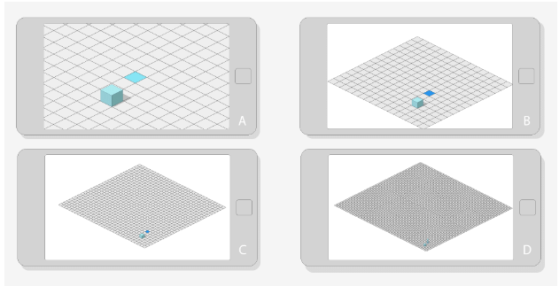
“A” will work better for a claustrophobic horror game (you can try to be even closer), “B” would be better for an RPG or RTS, “C” is getting unmanageable on a mobile phone or tablet, but could work on PC for large-scale military command. “D” is too small for any interaction; at this tile size selecting an individual tile is impossible (unless your audience is aliens with tiny fingers). There is an infinite number of scale steps between “A” and “D” and beyond. What would work for you depends on the type of game you want to make.
Now that you found a tile size you think works best, let’s move on to characters.
Step Two: Let’s count heads
How many heads fit in your character?

(Image by: Andrew Loomis)
Just a bit of a reference here: realistic and adult humans range from 7 to 8 head to body height. If your characters get into 8 heads and above, you are going into Greek God/Superhero territory.
But this isn’t a discussion about style or height. Height is relative, and two characters with identical proportions can still be different height.

Any style can be adopted to various head-to-body proportions.

(Image by: Garon Rossignol)
The main point to take away here is the size relationship between the character’s head and the rest of the body. For example, if you design a character that is 8 heads tall, what you are saying is that the body is 7 times more prominent than the head. Most of the communication and detail will happen in the body and the head/face will play a somewhat secondary role. This is not to say that the head will not be important; as humans, we are primarily drawn to faces and hands (and a few other protruding body parts). But the 8-head-tall silhouette puts facial detail and expressions at a disadvantage.

“A” – Face and body are clearly visible.
“B1” – Body occupies more canvas when your characters are 8 heads tall. Facial detail is hard to read.
“B2” – If your game requires emotions from characters with realistic proportions, you will need to use close-ups.

Most animated cartoons are in the 2-6 heads category. Although 8-head-tall characters can be playful and exaggerated, most of the time they would fall under a serious and realistic category. Anywhere above 8 heads tall can also be playful, but again the body will take a lot of attention from the head/face.
Questions to ask:
- How important are facial expressions to your game?
- How important is realistic movement?
- How silly/serious is your game? Realistic proportions suggest serious/realistic gameplay.
- What is the camera angle and does it change during the game?

If your game has a top-down view, the head will overlap significant parts of the body. For a 2-head-tall character you may need to reconsider and add more body. - What is the average head and body width?

Wider heads have a bigger surface area and will attract more attention and overlap more body parts if the camera is facing down. If your art style demands wider heads, go 1-2 heads up and add more body.
The reverse is also true about the body width.

Do you have wide-body characters that need to show more emotions be cute? Increase the head size.
Important rule to remember: Small-bodied characters allow themselves to be significantly bigger on the screen, communicate more emotions and allow more artistic freedom and distortion. This allows more objects and information of various scale to fit in the same screen space.

(Copyright: Microsoft)
Facial expressions are not important in Age of Empires. Individual units make little difference.
 (Copyright: Beeline Interactive)
Facial expressions and characters have more importance in Smurfs’ Village and even more in Minions Paradise. The characters (and their heads) are bigger on the screen.

(Copyright: EA)
Step 3: Relative scale and the Golden Ratio
So you got your characters and tile size. How big should you make other objects and buildings relative to characters? This is a great time to test if the selected art style and proportions fit the requirements of the game.
In general, if you picked realistic proportions for characters you should stick to realistic building and object sizes.

(Copyright: Firaxis Games)

(Copyright: Firaxis Games)
You can allow more distortions if you are aiming for a more mature audience and iconographic (tabletop) game like Civilization.
Let’s run through a common scenario:
- Player can interact with buildings.
- Player can interact with characters.
- Characters are 3 heads tall.
There is no rule here, but instead of picking numbers out of our hat, why not choose a proven and appealing starting point — the Golden Ratio, or 1 to 1.618? First recorded by Euclid, it is often found in the most pleasing designs. You can find the Golden Ratio is ancient architecture, famous paintings, plants, faces and body parts.

A few examples of the Golden Ratio in nature.
Use 1 to 1.618 as a starting point to make upper and lower height limits for your characters and buildings.

Obviously, if your characters are smaller than your buildings they can enter them. You can also use the Golden Ratio to design your buildings and architectural elements.
Should your game require tall buildings, you may want to consider using the Golden Ratio for additional floors.

Use “A” if your character needs to move between floors. Use “B” and “C” when no movement is required.
Don’t forget about the doorways.

[Source:- Gamasutra]


