Designer Warleson Oliveira has created a concept design for card game UNO, and its beautiful simplicity is proving very popular on social media.
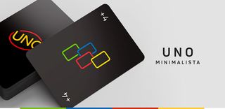
The new design for the classic game is a personal project by Oliveira, who is based in Brazil. He’s streamlined the logo, added block colours, and reduced the symbols on the cards to simple outlines. He’s also removed the fussy design found on the reverse of the pack, and replaced it with a dark background, creating a kind of UNO Dark Mode. There’s even a stylish new box – a nifty piece of packaging design that gives the project that extra edge.
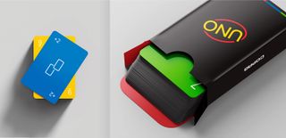
As personal projects go, it’s a good one. It’s a fully considered idea and all the different elements of the game have been thought of. Oliveira has even made some neat little animations, which he shared on social media (see below).
Perhaps not surprisingly, designers around the globe have reacted positively, with many suggesting Oliveira should talk to Mattel, who sell the game, about getting it produced. Others want to buy the designs, and are asking where they can do so.
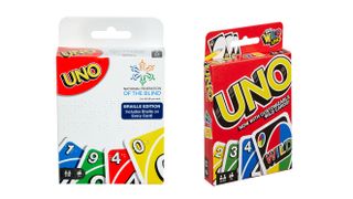
Although the current UNO design is iconic, there have been updates over time. An UNO Braille set was released at the end of last year, and there are also several other versions of the game, including colour blind accessible UNO, UNO Emoji and UNO Finding Dory. Who knew?
Perhaps if enough people get in touch with Mattel, the slick new UNO may become a thing, and we’ll all start pulling classy black boxes out of our bags, ready for a game of UNO in the pub. In the meantime, you can see more about the project and share your appreciation with the designer on the project’s Behance page.
[“source=creativebloq”]