 The Favourite–nominated for 10 Oscars this year–is a wickedly dark comedy. The story is something like a meaner Mean Girls set in Restoration-era England, as it profiles two real historical figures, Sarah Churchill and Abigail Masham, vying for the affection of Queen Anne.
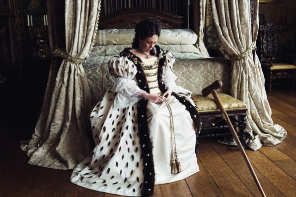
The twist is that this rivalry is really a race to the bottom. Queen Anne went down in history as a relatively unremarkable ruler who gained control by unexpected circumstance, and was never raised in preparation to rule the country. She suffered from all sorts of ailments through her life, like gout, which kept her largely immobile. She lost 17 children in attempts to produce a successor, and died at 49. Anne was pitiable by almost any measure, but she was still powerful. She was the queen.
Director Yorgos Lanthimos fills the drama with unexpected and, at times, hilarious details, creating a film that’s almost impossible to categorize as a viewer. And that sensation is enhanced by the production design itself, which unabashedly introduces all sorts of anachronistic elements, rather than creating a perfect historical portrait of England circa 1700.

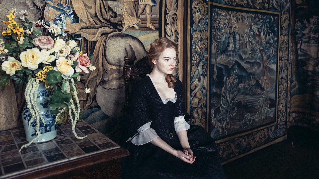
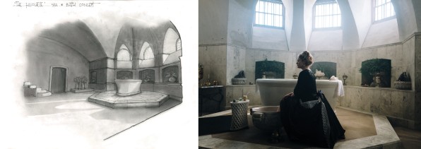
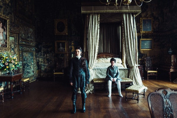
When production designer Fiona Crombie was signed on to build the world of The Favourite, she visited museums, studied books, and attempted to understand the aesthetics of Restoration-era England. And then, through her designs for the sets, she wrapped Queen Anne’s room in tapestries–countless tapestries, treated like a parody of wallpaper, blanketing the walls so much they concealed paneling and even doors.“Basically, I wanted it to feel like she’s in a padded prison,” says Crombie.
I mention that I didn’t know royalty from that era put that many tapestries on the wall.
“I don’t know if they did!” Crombie laughs. “I actually don’t know if they went that crazy with the tapestries. It just felt right for us.”
EMBRACING ANACHRONISM
The tapestries are just one example of how the entire art team–from costuming to staging–disregarded historical accuracy to create a depiction of British history in The Favourite that felt like its own world. Just as The Favourite‘s script takes vast liberties in rewriting facts and expounding upon historical rumors, so too did its production embrace splashes of anachronism in interest of the film’s aesthetic.
“I remember at one point, our set decorator, Alice [Felton], said to [director] Yorgos [Lanthimos], ‘You know, in 1705’–and he said, ‘What makes you think it’s 1705?’” Crombie recounts. “And we just all laughed. This has no anchor, really. It’s a representation of a period . . . but it’s skewed. I feel like this is almost like a parallel universe period film.”
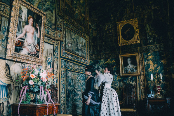
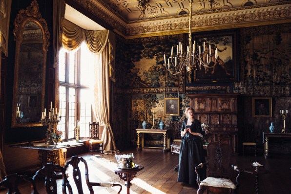
Operating within a tight $15 million budget, The Favourite was filmed at Hatfield House, a well-trodden historical manor in Hertfordshire, England, that has appeared over the decades in Batman films, the Tomb Raider franchise, Get Him to the Greek, Antiques Roadshow, and even Pride & Prejudice Zombies.Crombie stripped the rooms bare and built them back up from scratch. She wasn’t inspired by the home’s decor, but she did take cues from the space itself. She cloned the wood paneling in many rooms to create a few standalone sets, and she discovered black-and-white tile in the ballroom, which she installed across many rooms in the Hatfield House to create a congruous visual theme. The same black-and-white motif was woven into the modernized costume design, along with the actors’ hair and makeup. It’s a visual irony in the film–so much black and white in a world that is morally gray.
“We tried to have a visual economy through the film, a very tight palette and repeated signifies and motifs, so it feels aesthetically really strong,” says Crombie. “In the same way and, having monochromatic costumes, it’s stylizing it and pushing it out of naturalism, but without taking it into a place that makes you feel like you’re in a fantasy.”
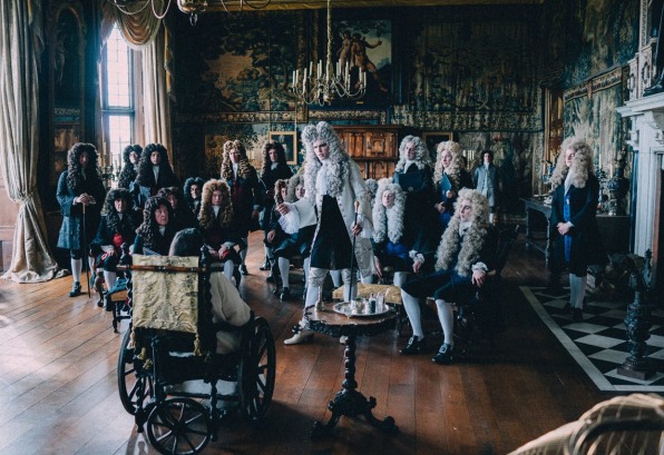
Queen Anne spends much of The Favourite in a wheelchair, but the wheelchair wasn’t invented until 1783. Similarly, Crombie had no historical precedent for Anne’s intricate rabbit cages (rabbits were akin to rats or food in the era, not pets) or the duck racing found in the script. “The discipline was trying to create those elements where they didn’t clash,” says Crombie. “And so the basic thinking was, What would it have been, if a wheelchair did exist at this time, what would it have been? We worked in a simple methodology through that.”
Crombie points out that, in this sense, her job isn’t much different than the writer’s. “So often we believe a period because we’ve seen it represented in film, which means we have an assumption even about language,” she says. “The reality is none of us actually know how anyone spoke to each other in private.”
LIGHTING THE WORLD
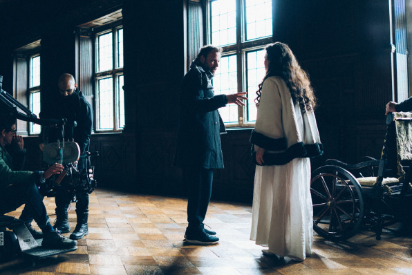
Practically, the greatest technical hurdle of the film wasn’t dealing with bunnies on set (or installing incontinence pads into the furnishings), or even the fact that the sets had to be constructed in 360 degrees so that Lanthimos could film them at any angle. The biggest challenge was dealing with the lighting.
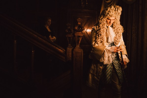
Because the film used no artificial lighting, everything on screen is lit by practical sources–either sunlight through windows, or candles burning on tables. The high-contrast, naturalistic aesthetic this approach ultimately created on screen is remarkable. But to get there, Crombie was forced to think about lighting as a very large part of her job to assist cinematographer Robbie Ryan.Look closely, and you’ll see every floor in the film has been stripped bare of coverings. Instead, the wood and tile was shined to a high gloss so it could reflect ambient light around the room. Crombie installed a lot of mirrors. Most fabrics were gold to enhance the warmth and brightness of the rooms. “It would have been terrible if I decided the palette would be dark blue” she says with a laugh.
Crombie was also forced to decorate rooms themselves with lots of light sources. “When it came to candlelight, we had to have as many candelabras as we could basically justify in the room,” says Crombie. “Every surface would end up with a candelabra on it. And the challenge is [to make sure] it doesn’t look messy or chaotic.”
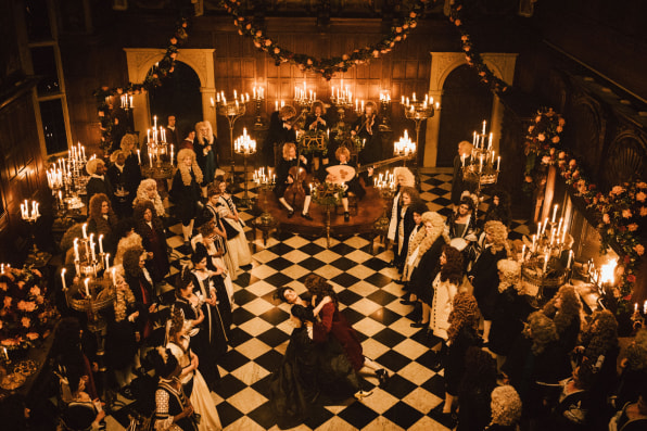
In the case of the film’s grand ballroom scene, the ceiling couldn’t support a chandelier, so all of the light had to come from a bonfire of candelabras mounted to the walls. Exterior shots at night had to be filled with real, working braziers. The only lighting rig Robbie deployed was to capture some scenes in which characters walked down dark corridors at night. But even for that, he used burning candles set on a trolley rolling alongside the camera.
All in all, the use of naturalistic lighting inside an anachronistic world creates a remarkably convincing universe–even if that universe is anything but real. Nearly everything about this historical film is ultimately a lie, or at least a fib, which is a tacit part of the movie’s twisted appeal.
Crombie says it better: “I think sometimes period films can be very polite. This film is impolite–but in as much as it’s brutally honest about human nature.”
[“source=fastcompany”]