
Material Design is excited to introduce Slot Components, a powerful technique that allows you to create flexible and dynamic layouts with ease in the Material 3 Figma Design Kit.
Figma’s local custom component nesting is made possible by slot components. Slot components don’t need to be disconnected from the main Material Design Kit because they give you more freedom to make changes to them. Components can now remain linked to the main library to receive updates and improvements as you change them to suit your needs.
Slot components are a step toward giving makers the flexibility they need in their components by: Allowing teams to extend component possibilities while still inheriting future updates and fixes.
Designers no longer need to Detach components for unique variants.
Material components are no longer fixed to only preconfigured offerings. Designers can now add custom variations to them!
Components for Material Design are now simpler and more powerful than ever. By adding slots to components, the maker can better express their requirements. Slots gives designers the flexibility to create new component variations while still using the guidelines of Material’s design system.
This aligns with how these container-like components are designed with how they are built–– crafting the design toolkit to mimic the component capabilities in code.
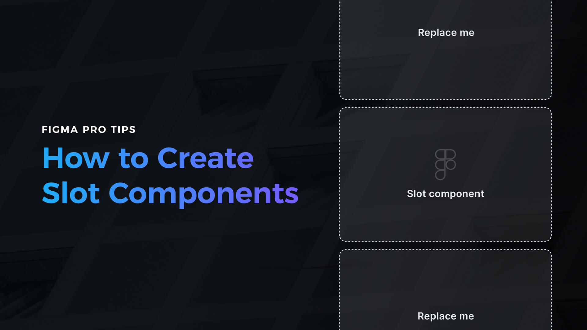
How slots work Explore the Figma Community’s Material Slot Component Playground file. Slots are now supported by some container-oriented components, like cards. There will be a distinct instance for activating each slot-enabled component. To switch to the slot placeholder content and reveal options related to the slot, select the Slot property. The slot can then be swapped for a local instance of another component.
Prior to slots
Before slots, the design kit offered a wide range of variations and possible component permutations for designs. These variations allowed for a variety of aspects to be manipulated or toggled on or off to maintain component boundaries, design intent, and ensure safe guiderails. Behind the scenes this requires very complex library building to capture all possible iterations, exacerbated by newly introduced component features.
The majority of people who used the design kit found these intricate parts to be an excellent “jumping off point.” However, for other use cases, designers would need to detach from the master library and break these components in order to achieve their objectives for even minute deviations that would otherwise adhere to guidelines. The result is designers lose their connection to the Material Design Kit library, component variations, state controls, and future library updates.
link
Copy the link Slots’ adaptability Designers can swap slots for any kind of custom content, such as Material or local custom components, by substituting an empty component placeholder. Containers for other elements like buttons and text strings can be found in cards, sheets, lists, menus, and toolbars, among other components. Slots give container components more flexibility than having the content fixed or baked into the component itself by allowing components to contain any type of content. This also brings closer alignment with how these components are built in code.


