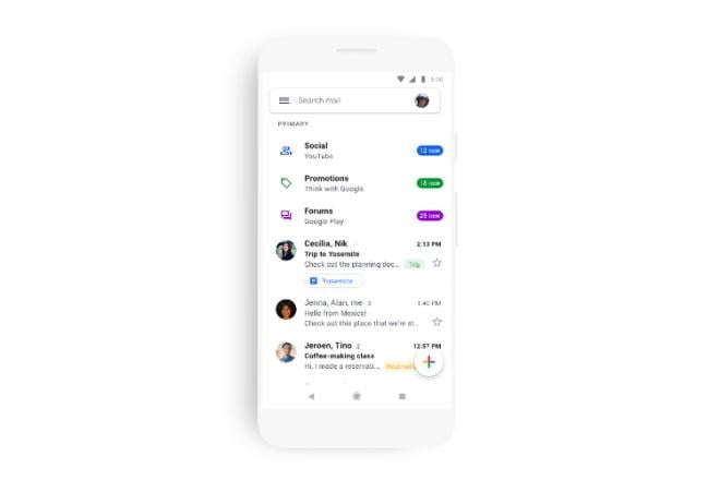

Google’s blanket rollout for Material Design on its apps is now a step closer. The Gmail app for Android and iOS has begun receiving the Material Design, making the interface rather decluttered and clean. Google’s venerable email service, Gmail got a makeover last year with new features, powered by Artificial Intelligence, besides the plausible change in the design on the desktop. The mobile versions and apps of Gmail followed the rollout on the desktop, including the Material Design that is now reaching the Android and iOS users.
According to a blog post by Google, Gmail’s new design is a “part of a larger effort to make G Suite look and act like a family of products, designed in the Google Material Theme”. The Material Design brings a better-streamlined approach to opening and scrolling the email threads, viewing photos without opening an email, and most importantly, switching between the personal and work accounts, which Google says will let you access mail from both the account “without breaking a sweat.”

Gmail on Android and iOS will also now show red-coloured warning signs and messages when the system algorithm detects an unusual email content or activity.
While the aforementioned features are already available on the Gmail desktop mode, their arrival on the mobile app yet does not bring the dark mode. Dark mode is increasingly getting wide adoption among app developers, including Google that has been spotted testing it on many of its G Suite apps, as well as rolling it out for the Android Messages app. Gmail joins other Google apps such as Calendar, Messages, Drive, and Dialer that now have the Material Design.
Google has noted in its blog post Material Design on Gmail will be widely rolling out to the Android and iOS users in “coming weeks”. The company says that following the rollout, the G Suite mobile apps will also receive the same design and new features “later this year”. It is not clear what apps will be the first to get the Material Design and new features.
[“source=financialexpress”]


