
HP’s corporate logo has remained pretty much the same for 75 years straight – blockish letters in a circle – though the current iteration was created in 2010. But its Spectre laptop range is back again to shake things up with Spectre 13, aka the world’s thinnest laptop, which is adorned with the much-loved, previously rejected logo by Moving Brands. Non-standard logos are actually almost standard when it comes to Spectre laptops, with last year’s Spectre x360 having ‘Hewlett-Packard’ written out – but HP will extend this sleek new logo across its entire premium laptop range.
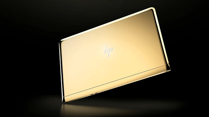
Spectre 13 also comes in a special edition (shown below), which the press released describes as “one of a kind”. They’re not wrong: the mind-blowingly ostentatious laptop is created with swanky 18k gold throughout the entire thing (even in the inside…where you can’t see it?), with rear, keyboard and top plates made of the same (yup, 18K again) and – of course – a new diamond-encrusted HP logo shines from its lid. Together, all this evokes what the press release feels is “Hannah’s minimalistic design philosophy”. Er, ok.

But the logo itself looks good. The branding is clear despite the minimalism of four slanty lines. For HP’s higher-paying premium customers, the logo is a gentle reminder of the more slap-you-round-the-face, main corporate logo.
To be fair, the outrageous bling is all for a good cause. The creation – made by LA-based (I mean, really, where else?) jewellery design Jess Hannah, with HP and Collectively Inc. – will be auctioned off to support the Nelson Mandela Foundation.
[Source:- Digital Arts]


