
In cities today, all data is political. Politicians use it as ammunition. Companies use it as leverage. And citizens use it to advocate. Yet while the open data movement has made it far easier to plunge yourself into the deep pools of data that cities collect, it hasn’t necessarily made it easy to use any of that data. “The data gap isn’t about data being accessible or inaccessible,” as David Gonzalez puts it. “It’s about data actually being used.” In short, collecting data is one thing. Making sense of it is another.
At the highest levels of city government, analysts and senior staff members must make decisions based on data from 70 different agencies and groups and millions of inhabitants, fragmented further by school districts, police precincts, and other divisions. While every agency might have its own tool to parse numbers, there wasn’t a tool to generate broad, location-based insights for the people at the top. “If you think about the target users of these tools, they have very little time. They need to get answers fast,” Gonzalez says. “And they need to see what they need to see—and nothing more—to be able to make decisions.”

Today, the N.Y.C. Mayor’s Office officially launched its own dashboard meant to do just that, built by Vizzuality, where Gonzalez is CTO, and Carto, a platform for location data tools. It’s designed to make sense of the bottomless data silos that a city as big, complex, and connected as New York generates every hour. While many cities employ various data visualization tools to track their metrics, this one is unique in the scope of data it pulls in real-time, and in the way it’s designed—to be a user-friendly tool for key actors within the government on a day-to-day, or even hour-to-hour, basis.
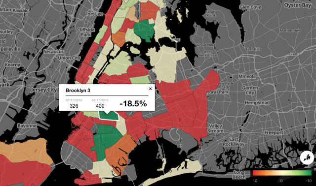
The dashboard pulls data from across the city, mapping it geographically to give decision-makers a bird’s-eye view of hundreds of “indicators” from across city organizations, which vary wildly across agency and can involve anything from robberies to traffic fatalities. For example, an indicator for the Housing Authority might be “average time to resolve elevator outages,” while for the NYPD one might be “major felony crimes,” or “average length of stay for single adults in shelter” for the Department of Homeless Services.
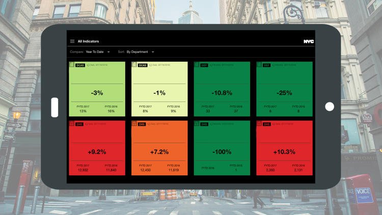
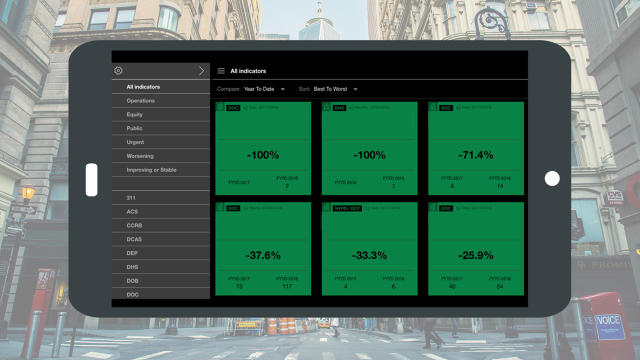
The responsive dashboard lets users understand how these topics are changing across the city in real-time by giving each indicator a color-coded card based on its performance, and allowing users to create their own threshold levels for indicators that matter to them and set up notifications—say, for an email ping when a certain neighborhood moves beyond a certain increase in real estate prices, or a certain number of complaints about street garbage or noise from 311 callers. They can do all of this on their phones, or through a conventional web app. Sharing is also easy: A simple click on a card within the dashboard generates an email that shares that piece of data with anyone in the government.
New York is a sprawling city—it’s more like a constellation of cities, in truth—and clearly understanding how certain events within one neighborhood or on one street will affect its neighbors is a massive challenge. Carto, whose platform served as the groundwork for the dashboard, specializes in this kind of location-based prediction technology. It’s not about chronological prediction, though; rather, it’s the difference between being able to predict how quickly housing prices are rising in one neighborhood versus being able to predict how those rising prices will affect the next neighborhood over. This kind of tech, as Carto’s COO Miguel Arias explains, could eventually be used to understand how flooding or natural disaster would ripple across the city—and inform steps to prevent it.

In the end, the data was always there—anyone can access it publicly, in fact—but Carto and Vizzuality gave it an interface and UX language that made it usable for a core group of users for whom poring over tables and Excel spreadsheets isn’t an option. “If data isn’t actually used, it doesn’t matter how accessible or available it is,” Gonzalez says. “And that’s the sweet spot you need to find.”
[Source:-Co design]


