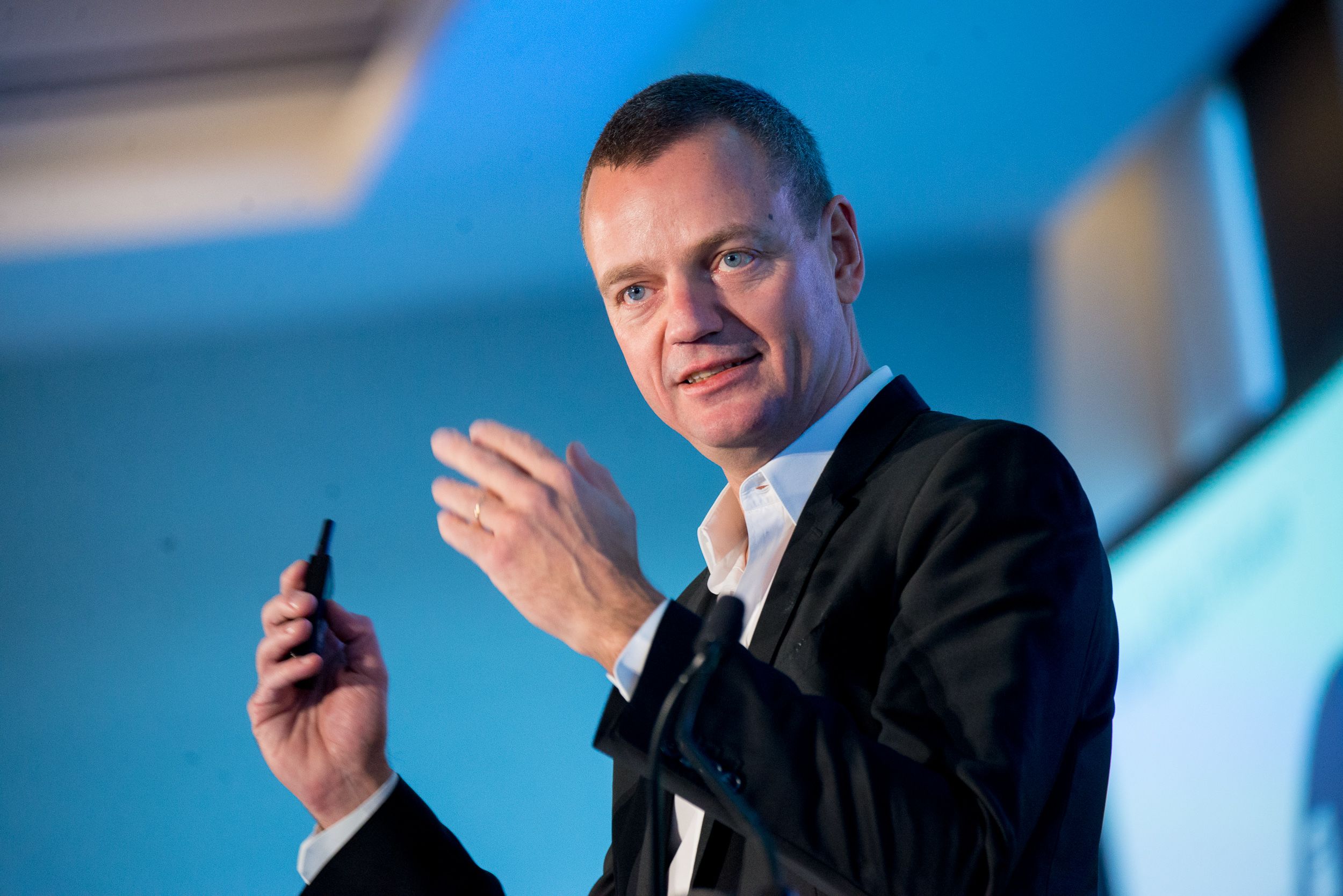

Tesla UI Lead Pawel Pietryka Dives Deep Into The DNA Of The Design Team
Tesla has raised the bar for transparency when it comes to direct-to-customer communications, but what happens behind the scenes at the creative haven where it designs its products is largely a mystery. Creative tech blog Work With Us went behind the scenes at the Tesla Design Studio and connected with Tesla UI designer Pawel Pietryka(LinkedIn | Twitter) for an in-depth discussion on all things Tesla Design.
a new home | a new challenge
After spending years designing for world-class firms around the globe, Pawel looked out from the hallowed halls of the design wing at Apple in Cupertino, California, and wondered what his next challenge might be. After some pondering, he came to the realization that the unknowns at Tesla and the challenges they were taking on head first were what he wanted to work on next. It was not just about design, but was the entire missional focus of the company that hooked him.

“I care deeply about our sustainability mission and our aggressive focus on innovation, and what we’re doing here is completely unprecedented,” he told Work With Us in an interview. “I’ve worked on many digital experiences, but none as exciting as an entire car.” Electric vehicles take everything we thought we knew about human-centric automotive design and threw it out the window. Add to that a tech company that is hell bent on not just designing and selling electric vehicles, but laser-focused on doing so by building the safest, most beautiful — and yet affordable — electric vehicles in the world and you have yourself a challenge.
Pawel took it on head first and he is not shy to tell the world about his passion. “I tell them to drop their dinosaur cars, to stop living in the past, to join the revolution. I try to explain that driving a car (or being driven by it) can actually be fun again,” he said. It is an experience that many of us who drive one of Tesla’s products know first-hand and one that is hard to convey without just putting some butts in seats and letting them stomp on the accelerator. “Driving a Tesla is honestly the most fun thing you can do – and we get to design that experience every single day.”
what’s in a name?
What is it that Pawel actually does at Tesla? Getting into the nitty gritty, Pawel said that his role is to lead vehicle and mobile User Interface (UI) design at Tesla. Think about that as the way drivers interact with the products themselves. First and foremost, that is the transformative landscape touchscreen display in the Tesla Model 3 that took on the imposing task of consolidating as many physical buttons and digital controls into a single intuitive display in a format that the company had never used before as a primary display. No small feat, and one that, in retrospect, many users not only appreciate, but have come to love as the centerpiece of the in-car experience.
The Model 3 carried forward many of the design cues from the Model S and X, but as a new lower tier vehicle had to stand on its own two feet four wheels against not just Tesla’s other offerings, but against the competition. The landscape display is one example, but the challenge took the interior of the vehicle in completely new directions from Tesla’s other vehicles.

The placement of the display in the Model 3 increases visibility. Image credit: Kyle Field | CleanTechnica
Taking all of the functionality from the multiple displays in the Model S and X and consolidating that into a single display was done by pulling the display out of the dash and surface-mounting the interface, as if someone married an iMac with an automobile. The move transformed the look and feel of the interior while at the same time improving the utility of the screen and visibility around the front of the vehicle.
a new yew eye
The challenge of redesigning such a key interface on the vehicle that the company was betting the farm on was no small task and Pawel knew it. “My first big project was to match the look and feel of Model S/X to the vernacular and interactions of Model 3,” Pawel said. The prospect excited him, with not just a static deliverable coming out the back end, but a dynamic operating system and user experience that would receive regular updates over time. The new screen also had to include the speedometer and some other items that are on a separate screen in the S and X.

The Tesla Navigate-on-Autopilot interface. Image courtesy: Tesla
A key component of the magic in the Tesla Model 3 user interface is the left-hand pane of the screen that displays a human-friendly derivation of what Tesla’s Autopilot system “sees.”
“We also work on a ton of Autopilot features and I’m very excited about shipping 3D-rendered cars in real time.” Tesla CEO Elon Musk told Lex Fridman in a recent interviewthat the new pane was a key component of the user experience in the Model 3, as Tesla wanted to give drivers enough information about what Autopilot was seeing to be helpful, but not so much that it overwhelmed them as they drove.
“Everyone knows good design needs to be functional, simple, intuitive. But more than anything it needs to deliver a great user experience,” Pawel said. “That means sometimes an experience needs to be fun, sometimes unconventional, and sometimes that means beautiful typography or other unexpected characteristics. I see a lot of good product and UI designers focus too much on the former. What’s the point of good, clean design if customers are not engaged or bored by it?”
freedom to explore and collaborate
Some of the world’s most creative companies, like Google, CleanTechnica, and Tesla, give their employees the freedom to and even encourage exploring other disciplines as a means of connecting the dots in our brains in ways that lead to better collaboration and ultimately better results. “Franz, my boss and the head of design, always says that we each have our homework, but if we want to branch out and collaborate with other teams it’s very encouraged,” Pawel said.
The necessity to explore the nuances of creative expression across the company has led Pawel to a new level of creativity that has already translated into multiple new projects. “Most of my projects are self-initiated, actually. We also like to dabble in creative technologies and come up with some crazy ideas. It’s always exciting to create something new that doesn’t exist.” That is more true at Tesla than at just about any other company in the world, as they challenge the status quo with every single battery that comes out of the Gigafactory and into a Tesla product.
creativity unleashed | relentless innovation
Melting pots bring together diverse skill sets and Pawel has found the blend of relentless innovation and the freedom to explore his creative pursuits to be the perfect special sauce for him. “You really feel something special when you’re here, everyone says that,” Pawel said. “I also like the pace, along with our intense focus on innovation.”
The creative cocktail is further refined with a relentless pursuit of the translation of the popular adage, “strong beliefs, loosely held” into the design world. Pawel speaks of a unique flexibility in design that has allowed the team to evolve into a hyper-dynamic, über-flexible engine for creativity. Pawel explains that, “We also have this incredible ability to shift focus and realign priorities in an instant. We’re lean by design and a byproduct of that is vastly more responsibility for everyone.”

Image courtesy: Tesla
We have seen this mental flexibility on display very publicly in Tesla CEO Elon Musk as he pulled out all the stops to achieve the elusive $35,000 price point for the base configuration for the Model 3 (among other things). For example, he publicly stated that the company would be closing its stores as a means of cutting out every single bit of non-core work from the price of the vehicle, slashing prices across the Tesla lineup as a result. Two weeks later, the company back-peddled, stating that it would only be closing underperforming stores, raising prices back up a few points each. Public spectacles like this make the strategy ill-suited for customer- and investor-facing changes, but for internal decisions, this type of flexibility integrated into the cultural fabric of a design team has resulted in a force to be reckoned with as Tesla churns out one beautiful product after another.
designing at the speed of innovation
To keep up with a company that is capable of pivoting away from one line of design into a completely different channel requires people who are mentally nimble and who will not be defeated by flushing hours, days, or weeks of work down the tubes in favor of a better overall result. “It’s important that they’re able to adopt our design process, which is much faster than other tech and automotive companies,” he said.

Image courtesy: Tesla
“The more versatile, independent and self-motivating, the better your chances. Our teams are very small and that requires everyone to be ultra-collaborative, non-competitive and just plain smart.” Lean teams can move quickly, but also require that more work be shouldered by each employee. Building a team that is capable of keeping up with the rapid pace of design, the high pressure of a very public company like Tesla, and the inevitable brutal attacks from the millions who stand to benefit from Tesla’s demise makes it a tough pill to swallow for some.
“I also look for someone who doesn’t accept the status quo of UI and wants to push it to a new paradigm or interaction, but doesn’t let their ego get in the way.”
[“source=cleantechnica”]


