
TOKYO — What do you think of when you see a tiny plastic spoon tucked into the lid of an ice cream cup? Not much, probably, other than wondering how delicious the ice cream might taste.
“Design Anatomy,” an exhibition running through Jan. 22 at the popular 21_21 Design Sight gallery here, provides lots of information about the design of such a spoon: one that accompanies a popular Japanese ice cream, the Meiji Essel Super Cup. As well as analyzing whether it can cut and scoop ice cream efficiently, and retrieve dregs from the cup, the exhibition assesses the spoon’s color, shape and material, and how a tiny rim around the top prevents ice cream from dripping out.
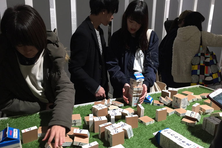
The spoon isn’t the only part of the Essel Super Cup to be probed so rigorously. “Design Anatomy,” which is curated by the Japanese graphic designer Taku Satoh as part of a 15-year research project into consumer product design, is equally zealous in assessing other elements of the ice cream’s development, including its branding, packaging, ingredients, the speed at which it melts and the employment practices of the factories where it is made. The same methodology is applied to four other Meiji products in the show — a yogurt, chocolate bar, cookie and milk — with spectacularly eclectic results. Giant three-dimensional models of the products, their packaging and logos are displayed beside painstakingly tabulated scientific data and samples of the grass eaten by the cows that produce the milk supplied to Meiji’s production plants.
The outcome is a strange, obsessive exhibition, which is dense with information, playful in parts, and unfailingly intriguing. Starting from the assumption that every element of a product’s evolution contributes to its impact, “Design Anatomy” strikes a dramatic contrast to the conventional template of industrial design exhibitions, in which mass-manufactured objects are placed reverentially on plinths like sculptures.
“It reveals that products have a much richer, longer, and more complex life cycle than we can possibly imagine,” said Paola Antonelli, senior curator of architecture and design at the Museum of Modern Art in New York, who visited the show last month.

“Design Anatomy” is the latest of a series of exhibitions to explore the cultural influence of design. “Zakka,” an analysis of anonymously designed Japanese household goods curated by the designer Naoto Fukasawa, was presented at 21_21 Design Sight last spring. The Italian product designer Martino Gamper has assessed different interpretations of value in design this autumn in three exhibitions running sequentially through Jan. 20 at the Seeds Gallery in London.
Artists are delving into similar issues. Design’s relationship to digital technology is an important theme of the solo shows devoted to the British artist Mark Leckey at MoMA PS1 in New York and the American artist Jordan Wolfson at the Stedelijk Museum in Amsterdam. (Those exhibitions run through March 5 and April 23 respectively.) A survey of the work of the German artist Wolfgang Tillmans opening at Tate Modern in London on Feb. 15 will include his photographs of car lights, computers and other heavily engineered objects.
The “Design Anatomy” project began in 2001, when deconstructed the design of Lotte Xylitol, a Japanese brand of chewing gum, for an exhibition in Tokyo. Convinced that most people only think of design in visual or functional terms, Mr. Satoh was determined to give them a fuller understanding of its influence and potential as, in his words, “an analytical tool to understand the essential qualities of things all around us.”
The process of a design anatomy begins when Mr. Satoh’s research team secures a manufacturer’s agreement allowing them to analyze all of the available information on a product and its history, including inspections of laboratories, factories and warehouses, and interviews with people involved in all stages of its development and distribution. Even the most humdrum elements are included, because Mr. Satoh believes that every stage of a product’s evolution has meaning.
Each design anatomy begins with branding and marketing, on the grounds that they are the first aspects of a product that most consumers encounter. The researchers then work backward through manufacturing and development, to sourcing raw materials, before presenting the results.
Mr. Satoh has conducted design anatomies of 50 products since 2001. Each of the five case studies in the 21_21 Design Sight show — which is funded by his office, the manufacturer, the gallery and its founder, the Issey Miyake Foundation — focuses on more than 30 aspects of its subject. Samples of equipment used in Meiji’s factories are displayed beside selfie-friendly exhibits, including colossal scale models of the Meiji Milk Chocolate bar and mushroom-shaped Kinoko no Yama cookie. There are also surreal touches like the rows of identical spoons bearing different quantities of yogurt to calculate how many spoonfuls are in each pot, and speculative models of Kinoko no Yama cookies made for the exhibition to show what they would look like in the shape of different mushrooms.
Mr. Satoh is convinced that, if consumers are better informed about a product’s development, they will make smarter choices and be likelier to appreciate their purchases, reducing the risk of them being discarded irresponsibly.


