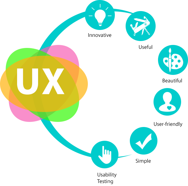
User-experience or UX is an inevitable part of any online entity today. The UX has to be relevant, user-friendly and innovative. It is fundamental in enhancing what your product or site represents while providing greater user-satisfaction. The entire process of acquiring and integrating a product, be it branding, design, usability and function are its main functions. Make it more meaningful to the user is the end game.
With each passing year, UX design is donning a sophisticated persona, and focussing on creating the best in class experience for its users.

With UX design trends evolving, here is a ready reckoner of the latest UX designing trends of 2019. Make them work in your innovation journey, and create new paradigms.
1. The huge potential of personalised design
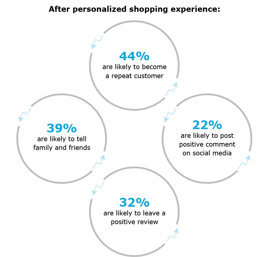
With sky-rocketing competition online, customers have become picky, and want to have the best experience from a brand or website. With the advancement of Machine Learning and Artificial Intelligence, companies are now focussing on providing a personalised experience to their users.
Personalised UX is one of the crucial dynamic UX trends which creates a customised user experience that caters to a specific user’s needs.
Learn from the biggies
Netflix is an ideal example of customisation. When you log into your Netflix account, you can see movie and TV show recommendations made by the app which are based on your preference or past behaviour.
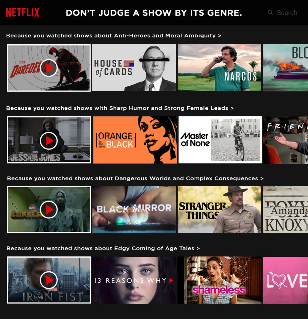
Another personalised UX feature Netflix uses the app to start streaming exactly where a user left a show/movie when he logged on earlier.

Amazon is another excellent template for providing a personalised user experience. The online retail giant has a massive database of products, and it uses past behaviour to determine product recommendations.
2. Unleash the power of storytelling
Good UX design is an expectation, not a bonus in this digital age. Storytelling has already become a critical element of the present UX designing trend. Most famous brands are now using the power of storytelling to create an experience for its users
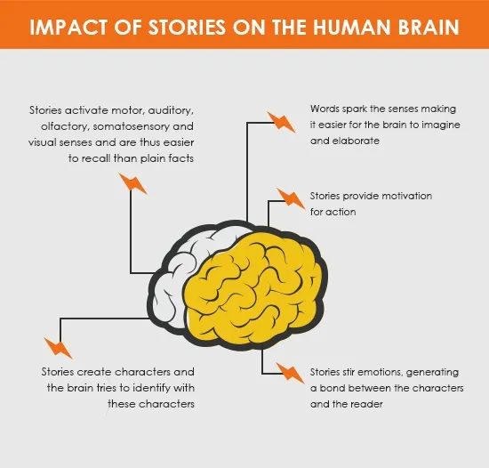
Storytelling is a powerful tool to understand, communicate, and, at the same time, adds humanness to UX design.
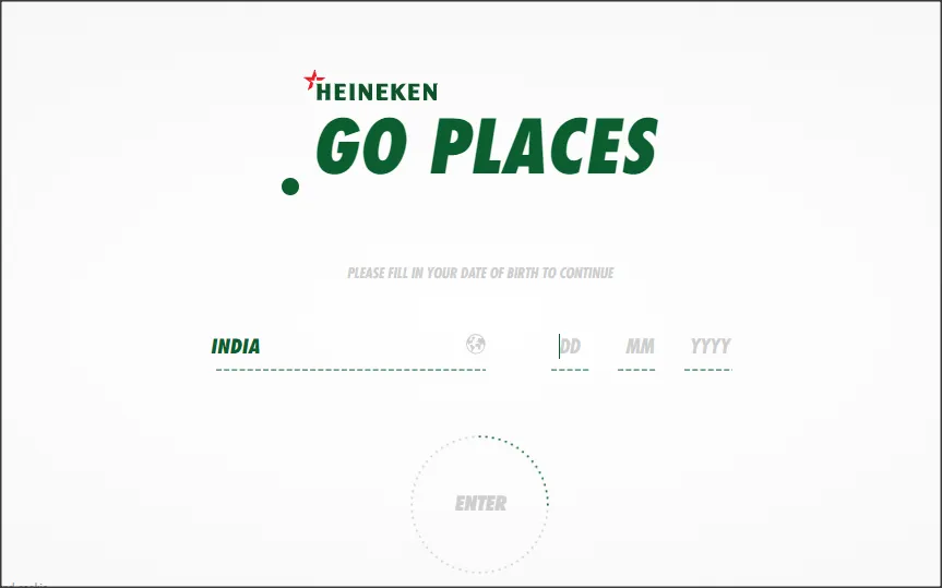
How Heineken did it?
Heineken created an interactive experience for job seekers that still outpaces the tradition job postings done by most companies. The entire job posting is an example of interactive storytelling that asks questions about the user’s work, and personal habits. It eventually gave a character type to the individual which then linked him to a relevant position in the company.
2. A paradigm shift from flat to material design
Flat design is all about minimalism – open, clean, crisp edges, usability with the use of bright colours along with 2D illustrations. Material design is focussed on grid-based layouts, engaging responsive animations, exciting light and shedding features, 3D icons, and lots more.
How Dropbox got it right
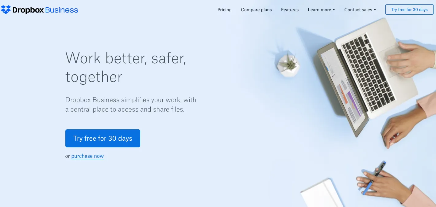
Dropbox is an ideal example of material design. The branded blue is the element which has created a whole new material outlook. The website uses a single-colour palette with black and white, which also includes a background.
The year 2019 is the right time to say goodbye to the bland minimalism of flat design because it doesn’t work accurately anymore. Embracing the enhanced liveliness, interactivity and detailing that material design lends can change the way one views a product.
3. Content focused user-experience
Here’s something to mull over in a tech-savvy environment. It’s something everyone knows, and if they don’t, here it is again – Content is king. Yet, design is queen. Combining the two can create the best in class user experience.
What’s the attention span of an average visitor on a website in this high paced and digitised society? It ranges between 8 seconds to 12 seconds. Essentially, you have a maximum of 12 seconds to create an excellent digital experience for your visitors, and leave a lasting impression.
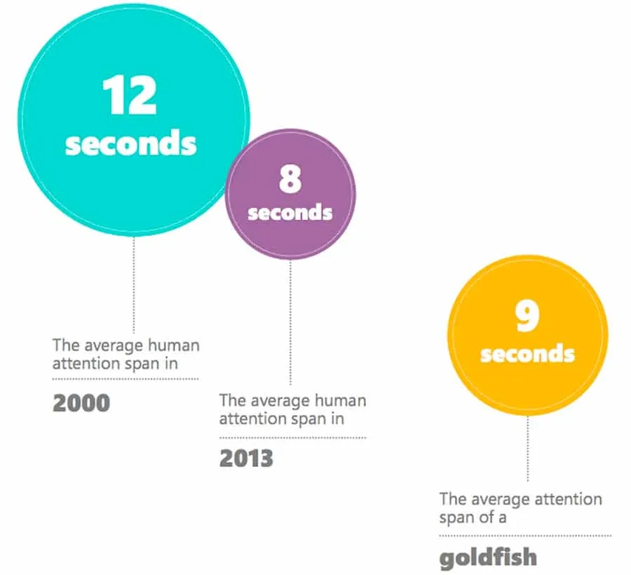
With that piece of trivia in mind, focus on creating content that is highly informed, and based on the requirements of a customer. That is crucial. Your story should smartly revolve around a user’s data, preference and behaviour.
How USA Today did that?
The official website of USA Today is the perfect example of providing an enriched content experience to its users.
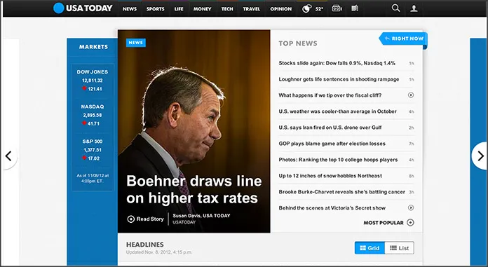
If you observe carefully, the site uses sharp lines and a rigid layout that helps the website maintain an orderly progression.
USA Today also allows visitors to choose from a list, and grid view of top stories. This gives a better experience to its users.
4. More gradients are in trend
Gradients, also known as colour transitions, are a gradual blending from one colour to another colour (or, it can be blended with different colours).
Gradients are the UX designing trend of 2019 as many projects are using it. They add a fun element to almost any design pattern.
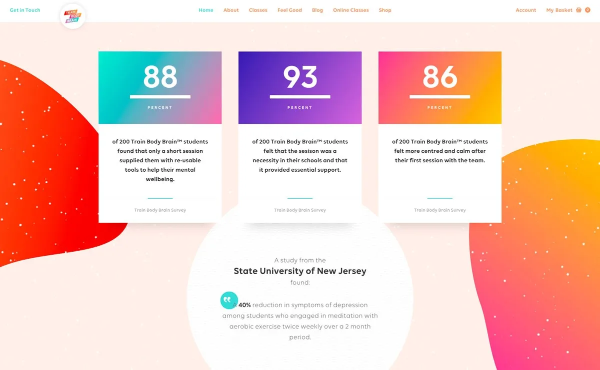
In the image above, see how the Tran Body Brain has used gradients to break out the text element.
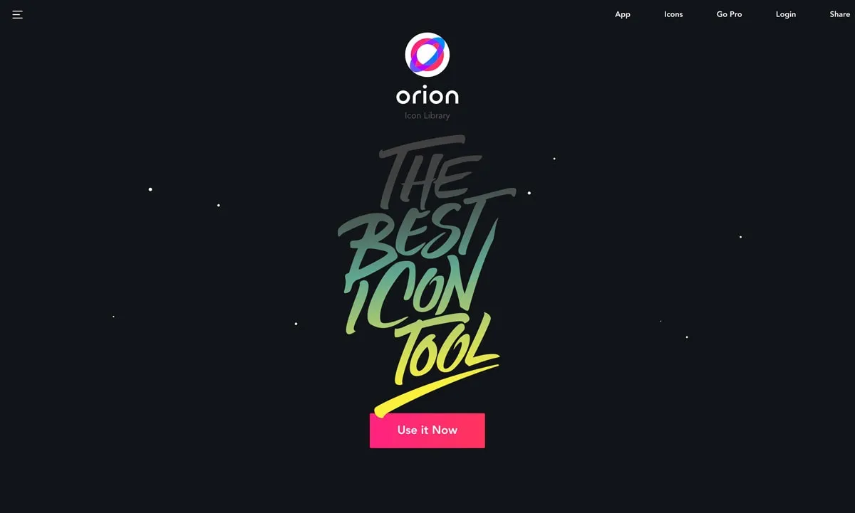
The Orion website too used gradients to highlight specific content, “The Best Icon Tool.”
In the above image, the website has used gradients well – the colour pattern is used as a background for product placement.
5. Split screen design rules 2019
This year, many of the most talented UX designers are focussing on creating a design that fits mobile users’ needs accurately. This is why split screen pattern designs are trending.
In this designing style, the desktop screen is divided into two panels of content which collapse into vertical content blocks on smaller devices.
The website shown above made use of a split screen device with two content blocks for added engagement.
While most websites feature side by side “screens” that are similar, designers are now shifting to asymmetrical splits for content. The design of the website below displays how an asymmetrical split can create verve.
6. Motion design
Today’s smart browser is faster, more powerful and want immediate gratification. Applying motion design keeps the interest going. Through engaging animation and intelligent visual effects, motion design breathes life into a digital interface.
From bouncing logos or spinning graphics as a page loads, there is a whole gamut of ideas one can use to add spright to a website with motion icons. This style is not just about creating a visually engaging interface; it is also about creating a meaningful user experience.
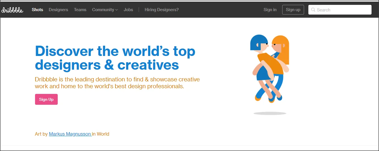
The above image is the home page of Dribble, where you can see a blonde girl and a blue-haired boy spinning round and round. It creates a sense of action on a website, and captures interest.
7. Age responsiveness
With more than half the global population having an internet connection, there are innumerable web users from different age-groups. This is where age-responsiveness adds a crucial element to UX design. A child, and a senior citizen won’t react in the same manner to the same content online. If a website is built with a child friendly design, it won’t create the same effect on a senior citizen and, similarly, children would find sites for senior citizens boring.
There is no such thing as a one-design-fits-all solution from the perspective of user experience. When it comes to designing user experience for a website, make sure the design is based on the age group of your target audience.
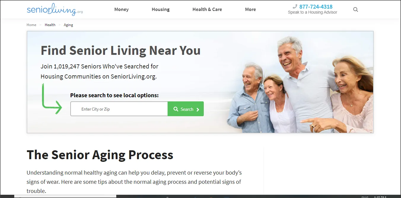
In the above image, Seniorliving.org targets the elderly. Notice the larger fonts, decent spacing, and clear designs without bright colours.

The menu options are also straightforward and easy to navigate. The main objective of this website’s UX design is to make everything simple for an older individual.
8. Flat design with 3D
Flat designs are trending again this year, but there’s a difference – a three-dimensional rendering. The mash-up of a 3D realistic, flat interface is visually appealing, and helps keep the user engaged.
It’s adds a subtle touch of virtual reality to a website’s design. And creates a buzz.
9. Thumb-friendly design
In 2018, smartphones featured seemingly large screen sizes. The large size of a mobile screen make one stretch their fingers. The thumb-friendly app and website designing trend has brought all crucial controls to the bottom of the screen. It is a design pattern which helps one reach fundamental parts of the app using the thumb, instead of using the other hand.
Very clearly, 2019 is taking user experience to the next level with continually evolving technologies. And what better way to update yourself than with the UX interface that is donning new identities to attract and engage customers.
[“source=yourstory”]