Apple gave its new MacBook Pro a thinner, sleeker case, which demanded a new, lower-travel keyboard, a new venting system, and even a smaller battery. But while I appreciate a Mac that’s smaller and lighter, I’d rather have a Mac that’s easier or just more fun to use. These 13-inch and 15-inch MacBook Pros with Apple’s new Touch Bar are both.
The Touch Bar brings my favorite things about the iPad Pro’s software keyboard to the Mac. The amount of useful shortcuts it adds is ridiculous, and this is beforemost third-party developers have even had a chance to add Touch Bar support. Even for a premium price—and these Macs aren’t cheap—I think the Touch Bar makes this a much more compelling buy than the MacBook Pro with function keys.
Meet the Touch Bar
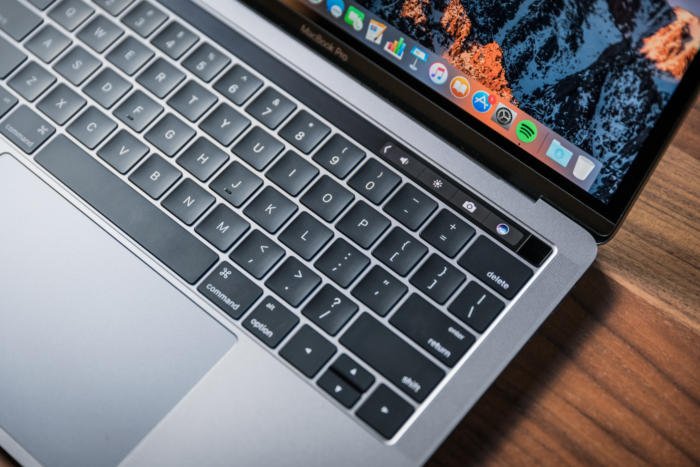
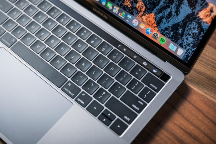
The Touch Bar is an OLED strip that’s tempting to call a display, but Apple wants developers and users to think of it as an input device, not a display. You can’t adjust its brightness yourself, for example, because if it was too bright it would start looking more like a display than a set of keys. It’s also optimized for viewing at a 45-degree angle, looking down from above, which is odd for any screen. Nonetheless, the Touch Bar stays visible and legible even if you are sitting at an off-angle to your Mac.
 Adam Patrick Murray
The Touch Bar is incredibly handy not only because its controls change to match the app you’re using, but also because it’s so customizable. Visit System Preferences > Keyboard, and you can choose what happens when you press the Fn key. The default shows the function keys: F1, F2, and so on. But if you never use those keys, you could also have the Fn key expand the Control Strip to full size.
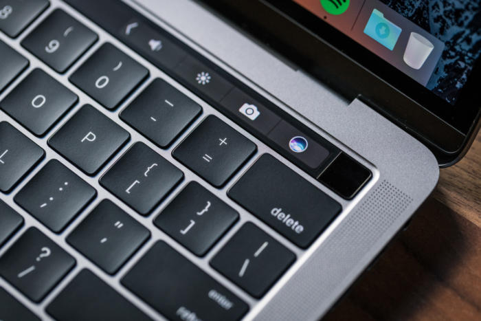
The Control Strip is a set of four of your favorite keys, and it stays on the right side of the Touch Bar all the time. You can choose which four buttons you want in System Preferences > Keyboard by clicking Control Strip. That will display a grid of buttons on your screen, and then you use the MacBook Pro’s giant trackpad to drag them from the screen directly onto the Touch Bar. The default set of Control Strip keys is brightness, volume, mute, and Siri, but you can select from tons of useful shortcuts, like buttons to take a screenshot, start dictation, open Notification Center, or put your Mac to sleep.
Adam Patrick Murray
Sure, you could use keyboard shortcuts and hot corners to do these things instead, but having them on the Touch Bar is better. The Control Strip has room for four buttons, and you can tap an arrow to expand it to the full set of controls that once lived on the row of function keys (screen brightness, Mission Control, Launchpad, keyboard backlighting, iTunes controls, volume controls).
The Escape key, which is no longer a real physical key, hangs out on the left side of the Touch Bar almost all the time. The only time it goes way is when you expand the Control Strip to its full length, but when that happens, an X button shows up where you’d expect Escape to be, and tapping X shrinks the Control Strip again to reveal the Escape key. Keyboard shortcuts that use Escape still work (like Command-Option-Escape, to force-quit an app), but if you’re concerned that the Touch Bar itself could freeze up and prevent that, you could always remap Escape to a different physical key. I’m not going to bother, because in my time with the Touch Bar, it’s worked perfectly.
Using the Touch Bar in apps
Along with the Escape key and the Control Strip, the Touch Bar holds app-specific controls in the center, and that’s where the real magic happens. This is just a short list of the ways the Touch Bar delighted in me in each app.
- In Mail, the Touch Bar makes sorting the inbox fast and easy, with buttons for flag, archive, and delete, as well as a button that guesses where you might want to file each message.
- In Safari, when a video starts playing, a pause button and scrub bar appear on the Touch Bar. Tapping that pause button is a much quicker way to shut the video up than having to find the cursor onscreen, then find the video and often hover over it to get the player’s pause button to appear.

Adam Patrick Murray
- Also in Safari, when you select the Location bar to type in a new URL or search, the Touch Bar fills with favicons for your favorite sites. The first time I saw the Macworld logo on the Touch Bar, I giggled out loud.
- When filling out forms in Safari, QuickType suggestions on the Touch Bar will pop up with your name, address, phone, and email when you tab to those fields.
- In Messages and Mail, the emoji picker gets a button on the Touch Bar. Tap it and you can scroll through all the emoji or jump to a certain category. It’s faster than pressing Command-Control-Space and then using the Character picker to find and click emoji with the trackpad.

Adam Patrick Murray
- In Calendar, if you select an appointment that someone else invited you to, there’s a button on the Touch Bar to send that person a message.
- If I’m trying to navigate with mostly the keyboard, dialog boxes can sometimes pull me out. Now, the options in a dialog box also show up on the Touch Bar.
- I also love how the Control Strip’s volume and brightness controls are a single button, and not two buttons (one to increase, one to decrease) like on a function key Mac. You just tap the button to see a slider, and you can even tap and keep your finger down to slide up or down, even if your finger isn’t directly on top of the slider. A smooth slider makes more sense than having to tap-tap-tap a single key to crank the music or brighten your screen.
Mostly, the Touch Bar just adds a new level of surprise and dare I say delight to using a Mac. It’s a bigger deal to me than Sierra’s addition of Siri, because while talking to my computer in the middle of my office isn’t something I’m comfortable doing, using the Touch Bar isn’t a stretch at all. My hands are already on the keyboard, and my eyes are already on the screen, so the Touch Bar is in a great spot for my eyes to flick down while my fingers reach up. Tapping a button on the Touch Bar takes less movement than reaching down to the trackpad to click that same button onscreen. Sure, keyboard shortcuts are even faster, but I don’t remember keyboard shortcuts for even a fraction of the buttons I see on the Touch Bar.

Adam Patrick Murray
Third-party developers are adding Touch Bar support too. Apple says that Microsoft Office, Photoshop, Pixelmator, the Omni Group’s apps, djay, and many more apps will be updated to support the Touch Bar. Some apps have limited support without an update—I’m typing this in Byword 2.7, which doesn’t have official support as of this writing, but the Touch Bar is showing me the same QuickType options and emoji picker that I enjoy in apps like Messages and TextEdit. If I select some text, I get the same formatting controls in the Touch Bar as I would in Mail or Pages. I’ll take it.
Speaking of QuickType suggestions, this is one area where the Touch Bar falls flat. I type about 80 words a minute, and suggestions just can’t keep up with that, lagging as far as two words behind my fingers. While I’m in the midst of typing a sentence, the words tend to freeze up and only change when I stop typing. But the suggestions can be useful if you’re a hunt-and-peck typer, or you’re, say, holding a sandwich in one hand while one-finger typing with the other. (Hey, a lot of us eat lunch at our desks.)
 Adam Patrick Murray
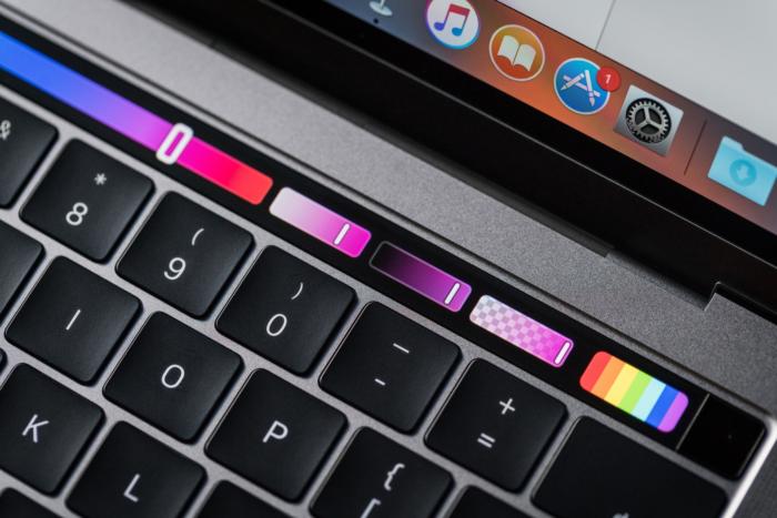
I love being able to customize the Touch Bar. Check the View menu of the Finder and all your Apple apps (except, frustratingly, iTunes) for an option to Customize Touch Bar, and then you can rearrange the buttons on the Touch Bar itself, or use the trackpad to drag new buttons from an onscreen menu right off the bottom of your display, where they drop down onto the Touch Bar. It’s a cool effect, and fairly intuitive even the first time.
The Touch Bar also has Touch ID, which lets you log into your Mac, authenticate Apple Pay transactions in Safari, and authorize purchases in the iTunes and App Stores without having to type your password. I also love being able to use Touch ID in System Preferences, instead of typing my Mac’s password. Developers can use Touch ID too—1Password already added support, letting you unlock your password vault with Touch ID, just like you can on iPhones and iPads with Touch ID.
But overall, it’s just really cool to have contextual controls on top of the keyboard—I praised the 12.9-inch iPad Pro’s software keyboard on the first day I got it because it had so much real estate that it was able to include extra buttons and controls. Ditching the function keys on the MacBook Pro gave Apple that extra real estate to bring the best parts of iOS—the freedom to put buttons where they’re most useful, when they’re most useful—to the Mac.
Performance
Let’s not forget that there are computers attached to these Touch Bars. In my earlier review of the 13-inch MacBook Pro with function keys, benchmarks showed only a slight improvement in CPU speed over the previous generation, but much better graphics performance. These MacBook Pros did a little better.
 Adam Patrick Murray
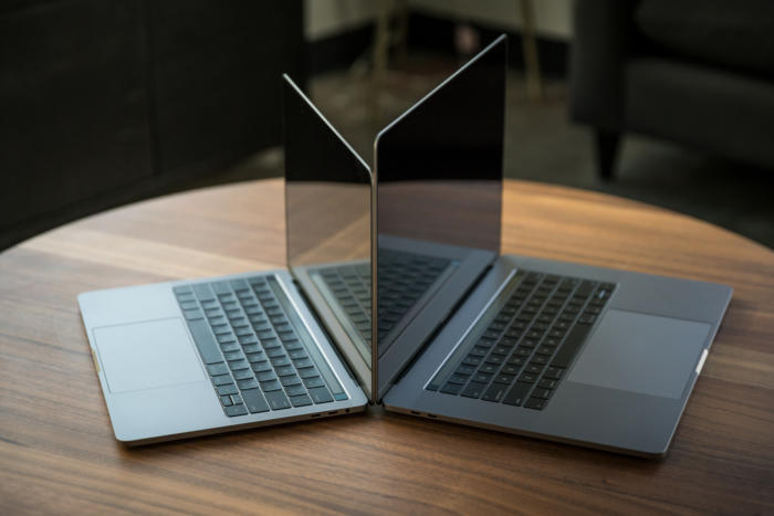
Apple supplied us with stock, entry-level models of the 13-inch and 15-inch MacBook Pro with Touch Bar. The 13-inch has a 2.9GHz dual-core Intel Core i5, 8GB of 2133MHz RAM, Intel Iris Graphics 550, and 256GB of storage. The 15-inch model has a 2.6GHz quad-core Intel Core i7, 16GB of 2133MHz RAM, Radeon Pro 450 graphics with 2GB of memory, and 256GB of storage. We also had a stock model of the 13-incher with function keys, which makes comparing them across the line pretty easy.
In Geekbench 4.0.1, the 13-inch MacBook Pro with Touch Bar scored 3927 in the single-core 64-bit CPU test, which is 5.3 percent faster than the previous generation’s score, and 4.2 percent faster than the just-released 13-inch 2GHz MacBook Pro with function keys. The 15-inch MacBook Pro scored 4216, which is just 1.5 percent better than 2015’s 15-inch MacBook Pro with 2.5GHz quad-core Core i7 with 16GB of RAM and a discrete AMD Radeon R9 M370X.

In the multicore CPU test, the 13-inch MacBook Pro with Touch Bar bested last year’s 13-inch Pro by 7.9 percent, and this year’s function key model by 3.8 percent. The 15-inch MacBook Pro with Touch Bar was was actually edged out by last year’s version in this test.

In Geekbench’s OpenCL test, the 13-inch MacBook Pro with Touch Bar scored 30826, using the Intel Iris Graphics 550—that’s 59 percent better than the last generation. The 13-inch MacBook Pro with function keys has Intel Graphics 540, and so this Touch Bar model scored 8.6 percent better.
The 15-inch MacBook Pro with Touch Bar scored 42827 in Geekbench’s OpenCL test when using the AMD Radeon Pro 450 graphics, which is 38.7 percent better than the last gen. This model has 2GB of dedicated graphics memory, but you can upgrade to a Radeon Pro 460 with 4GB of memory for $200. The 15-inch MacBook Pro also contains an Intel HD Graphics 530 chip that can be used to extend battery life during less-intensive tasks.

Using Cinebench’s OpenGL benchmark to further test the graphics, the 13-inch MacBook Pro achieved 36.8 frames per second, which is 27.5 percent faster than 2015’s entry-level 13-inch MacBook Pro, and 9.4 percent faster than this year’s 13-inch MacBook Pro with function keys. The 15-inch MacBook Pro scored a whopping 70.4 frames per second, which is 13.7 percent faster than the last generation.

So does this mean the 15-inch Mac powerful enough for pro video editors, even with a maximum of 16GB of RAM? Probably. There’s a chance Apple will increase the RAM to 32GB next year if it updates the MacBook Pro line to Intel’s next-gen Kaby Lake processors, but even now, one professional video editor who uses Final Cut Pro finds the MacBook Pro “buttery smooth.” It’s worth noting that the 15-inch MacBook Pro can drive two 5K external displays, plus the 2880×1800 built-in display, and still have ports for two external Thunderbolt RAID arrays.
Redesign pros and cons
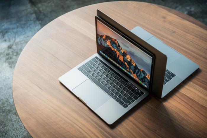
The redesigned bodies of both models are thinner and lighter than the MacBook Pros they replace, but there are tradeoffs to achieve this svelter size. The low-travel keyboards use Apple’s new butterfly mechanism. This keeps the nicely sized keys from wobbling if you strike them off-center, but I much prefer having more travel, like on the last generation of MacBook Pro and the MacBook Air line, and I’d be willing to carry a thicker laptop to keep that style of keyboard. (It’s a personal preference, of course.)
Adam Patrick Murray
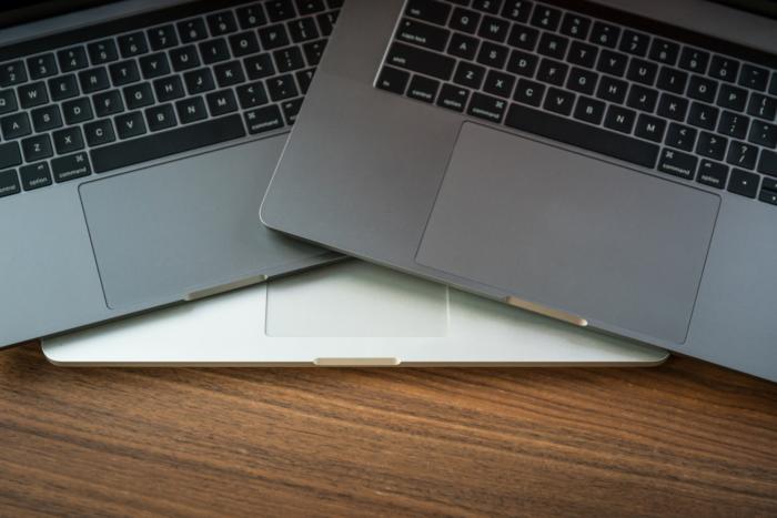
Another quirk is the fan vents on the bottom, one on either side. They feel almost sharp if you happen to run your finger across them, and since they’re on the bottom of the machine, I’d worry about getting water in them if I happened to spill on the desk but not on the computer itself.
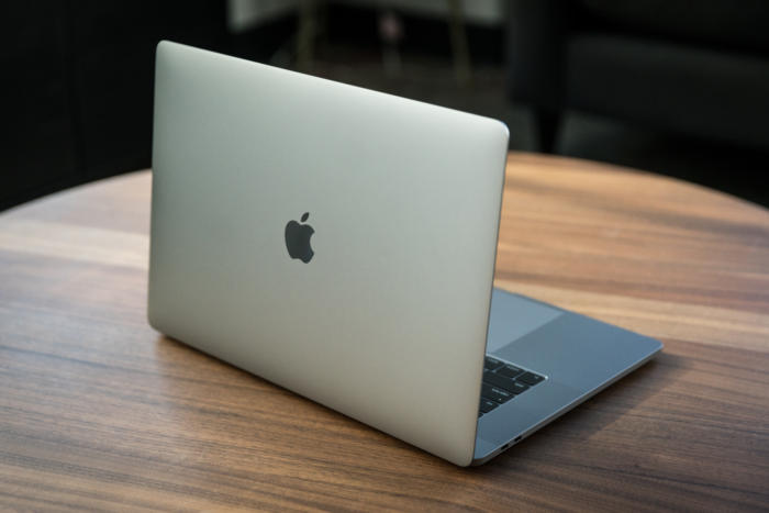
Oh, and the Apple logo doesn’t light up anymore, just like on the 12-inch MacBook. That’s a bit of a bummer.
Adam Patrick Murray
What isn’t a bummer are the new speakers, my favorite non-Touch Bar feature of the new machines. Apple explained that since they are connected right to the battery with no transformer between them, the speakers can get twice the peak power—and you can really hear the difference. Music sounds great when you turn the volume all the way up, and the speakers are powerful enough to provide satisfying sound while watching movies, TV, and sports. The 15-inch model’s speakers seem to have more oomph than the 13-incher’s, but both can ably fill a hotel room with music, if you should want to leave your portable Bluetooth speaker at home.
Adam Patrick Murray
Battery life is also solid, with both models lasting a full day of heavy use, with multiple apps open, dozens of Safari tabs, streaming music to Spotify, and occasionally indulging in some video viewing with Sierra’s picture-in-picture feature. More detailed battery testing will come in a separate article.
Bottom line
These new MacBook Pros have a lot going for them. Their biggest weakness, across the whole Touch Bar line, is price. The 13-inch model I tested is $1799 without any upgrades, and the 15-inch is $2399. Going to 512GB of storage is $200 extra, and 1TB is $600 extra, which also seems like a lot. (To compare, last year’s 15-inch MacBook Pro with a discrete AMD graphics chip started at $2499, but that included 512GB of storage.)
These prices could come down a little bit next generation, but if you need a MacBook Pro right now, the late 2016 models are solid performers. If I were buying one for myself, I’d go with the 13-inch MacBook Pro with Touch Bar and max out the storage, although the 15-inch model is even better.
[Source:-MAC WORLD]
