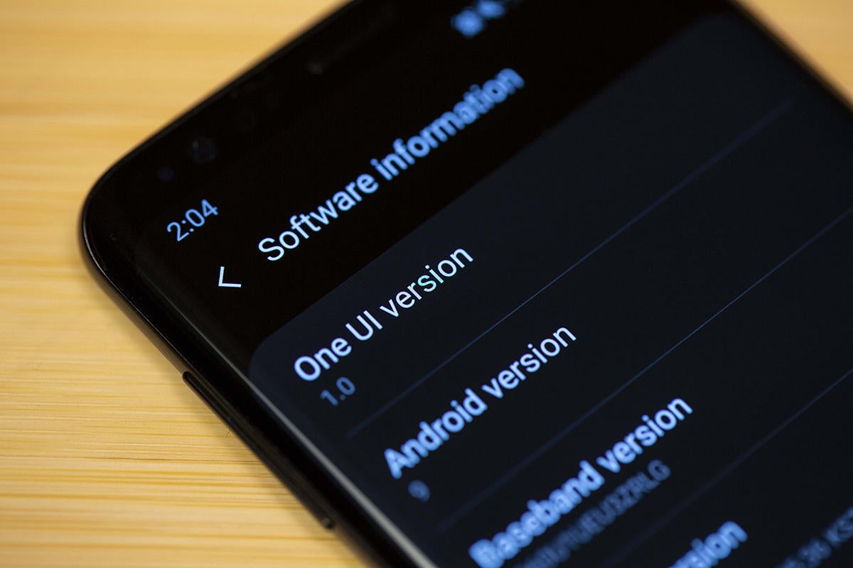
Whether you call it TouchWiz or the Samsung Experience, the interface on Galaxy phones has always felt like it was fighting Android rather than embracing it. It’s not just the presence of duplicate apps for everything Google makes, or even the proprietary app store that sells Galaxy-branded versions of Play Store apps. More than any other skin, Samsung’s phones have always pretended Android wasn’t really there, slathering it with a thick coat of paint and ignoring many of the latest features.
 Christopher Hebert
Whether out of fear or respect, however, Samsung kept its resistance superficial. The branded features and other tweaks were mostly superfluous and cosmetic. The Galaxy phones suffered as a result, with an interface that always felt cobbled and heavy-handed.
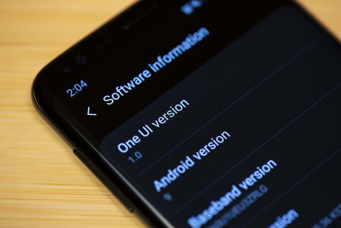
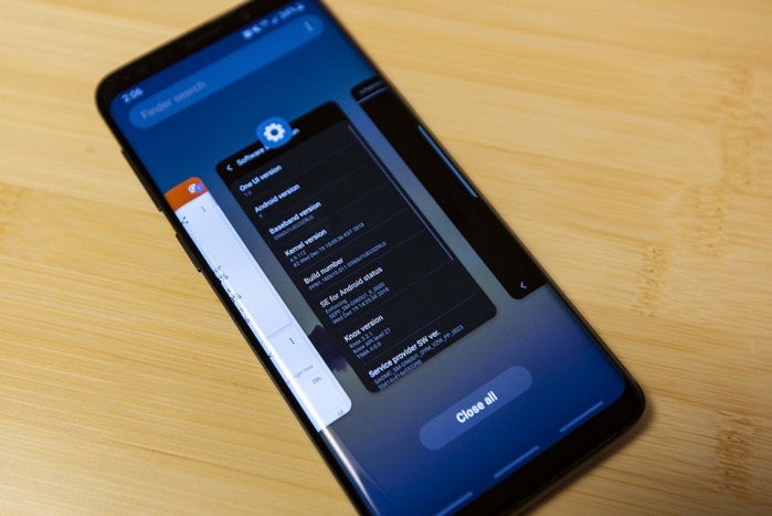
That’s changed with One UI. Samsung’s newest OS update is still powered by Android 9 with the Samsung skin on top, but it adds a new layer that’s unlike any previous Galaxy interface. It’s not different for the sake of being different. It’s different for the sake of being better.
When Samsung announced its Android Pie update at the company’s developer conference in November, it was clear that this was no normal refresh. Samsung put a great deal of effort into refining and rethinking the Galaxy UI, known these days as the Samsung Experience, with an eye on the folding and 5G future.
 IDG
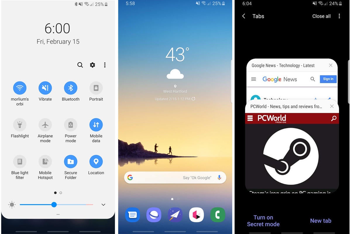
IDGMost obviously, there are new app icons and fonts, but the visual changes go far beyond aesthetic tweaks. Samsung says One UI was created so its hardware and software will “work together in perfect harmony.” There’s a definite Apple-like simpatico between the curves of the S9 and the new design language. One UI feels as light and fluid on the Galaxy S9 as Android 9 does on the Pixel, and it’s going to feel right at home on the S10.
Most notably, One UI looks nothing like the Android 9 Pie you see on the Pixel phones and OnePlus 6T. It looks like it was made for Samsung’s phones. The Galaxy suite of apps have always had their own unique interface, but One UI introduces a brand new approach to presenting content and controls that takes intent into account. With One UI, Samsung has broken free of the restraints of Android and developed a language for its apps that’s smart, stylish, and sophisticated. I’ve been testing One UI on the S9 for a few weeks, and I actually miss the new Samsung apps when I switch to another device. Samsung’s latest phones have always been the most beautiful phones to run Android, but One UI on the S10 will finally bring an interface to match.
Rethinking functionality
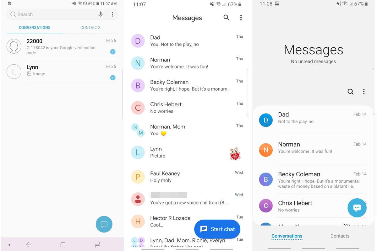
One UI introduces two new areas of interaction when it comes to apps: content and control. The philosophy is simple but remarkably slick, making it easier to access content with one hand without needing to access a shrunken mode. As a result, interactions are quicker and more enjoyable.
 IDG
IDGWhen you launch a Galaxy app, the content you need, such as recent messages or contextual menus, are all pushed lower on the screen, so they’re at both eye and thumb level. Once you start tapping and scrolling, things expand fill the screen as usual, but One UI wisely puts the emphasis on the first tap. More often than not, your fingers will be positioned where they need to be as soon as an app is opened.
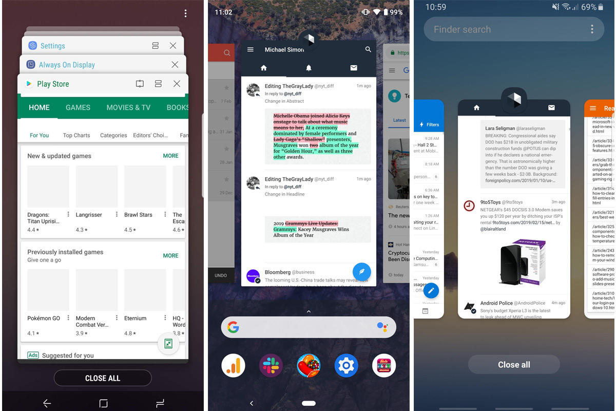
Navigation cuts down on the taps, too. Google introduced gesture navigation in Pie, but Samsung’s method is simpler and more natural. Instead of a home button, Samsung merely adds gestures to the existing system: Swipe up from the center to go home, the right to go back, and the left to see your recent apps. That’s it. There’s no new system to learn, no new muscle to train. After a day, I was already trying to do it on my other phones. The system will surely become more sophisticated as it evolves, but for now, it’s smart and speedy. With the S10’s rumored super-slim bezels, gesture navigation will feel incredibly fluid, like a smart piece of glass ready to respond to your touches.
Dancing in the dark
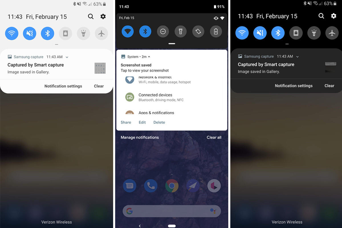
But the piece de resistance of One UI is Night Mode. A long-awaited feature of Android proper, Samsung’s One UI version is fully baked—there’s even a button in the quick settings menu to toggle it on. Night Mode in One UI takes full advantage of OLED screens, painting the notification panel with a gorgeous, deep-black brush and giving the whole system a refined, nearly lustrous sheen.
 IDG
IDGIt’s the first time I haven’t wanted to dump Samsung’s apps in a folder and forget about them. Each and every one of them looks beautiful in dark mode. Even things like the notification panel are given new life. The bright blue of the quick settings icons pop against the dark background, and even the buttons on the Calculator look sharper. Honestly, I hope Google simply copies One UI for the rumored dark mode in Android Q, because it couldn’t get much better.
I can’t believe I’m writing this, but One UI actually feels like Samsung is ahead of Android. Everything that made the Samsung Experience feel clunky and cluttered has been removed and refined. It feels like both a fresh start and a clean break from what Samsung perceived as the shackles of Android. By bringing it to the S9 before the S10, Samsung is laying the groundwork for enhancements that take advantage of the hardware to create a seamless, elegant experience.
 IDG
IDGOne UI isn’t just for phones, either. Samsung’s recently launched Galaxy Tab S5e tablet has it on board. The heavily rumored Galaxy Watch Active will also seemingly ship with One UI, bringing a visual and functional harmony among Samsung’s devices unlike anything in the Android ecosystem. While we’ll all drool over the Galaxy S10’s curves and edges, it’s what’s under the screen that will really set it apart.
[“source=pcworld”]
