
There have been more than 100 years of Olympic logos at this point, and the truth is, most of them are sad as fuck. So it’s entertaining to watch noted logo designer and cranky design curmudgeon Milton Glaser—creator of the “I Love NY” and Brooklyn Brewery logos, and, more ignominiously, the gaudy gold-plated identity of Trump Vodka—review the past century of Olympic graphic design over at AIGA’s Eye on Design.
Spoiler: Most are not viewed favorably.

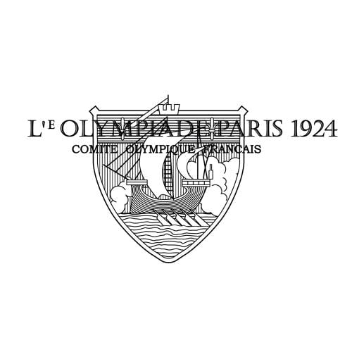
Let’s get the bad out of the way first. Glaser’s least favorite logos are that of the 1924 Paris Summer Olympics and the Berlin Summer Olympics in 1936. The former logo appears to represent an oared Viking ship, and doesn’t even contain the Olympic rings. Glaser rates it a mere 20 of 100. He writes: “Bad beginning, the elements are unrelated visually and the imagery is confusing. The surprinted lettering is unreadable.” The Berlin Summer Olympics logo defies easy description. It resembles a garishly inept line drawing of a bell embossed with a Nazi S.S. Eagle; Glaser calls it “strange and lacking focus.”

Another early Olympic logo Glaser dislikes is that of the Lake Placid Winter Olympics in 1932. Seemingly depicting an alpine skier plummeting into a U.S.A.-shaped gorge, Glaser rates it a 30 out of 100, calling particular attention to the typography, which he calls “peculiar and unpleasant.” He similarly dislikes the typography on the logo of the London Summer Olympics in 1948, which he describes with just one word: sad. It gets a 37 out of 100.

Not that Glaser dislikes all Olympic logos. He calls out the Tokyo Summer Olympics logo from 1964, with its gold typography and rising sun motif, as the best Olympics logo, ranking a 92 out of 100. (Personally, I think it’s simple, clichéd, and dull.) He also loves the 1960 logo of the Squaw Valley Winter Olympics—my personal favorite—giving it an 80 out of 100. “The star form is distinctive and unusual. It contains the rings effectively and plays well against the circle of typography. It has a fresh look to it.”
As for the Olympic logos of the present and near future, Glaser likes Rio 2016’s logo a lot: He rates it an 85 out of 100. “A presentation that looks fresh and contemporary. The athletes joining hands at the top are executed in a way that works well with the other elements. It feels like something new.” Unfortunately, the logo for the 2018 Winter Olympics in Pyeongchang doesn’t fare nearly as well. Glaser describes it as fragmented, and says “the complexity . . . of the mark makes understanding unlikely.” It gets a 60. Glaser abstains from ranking the 2020 Tokyo Summer Olympics logo because of the surrounding controversy, only noting that it raises “some fascinating questions” about graphical arts plagiarism.
[Source:- Co design blog]